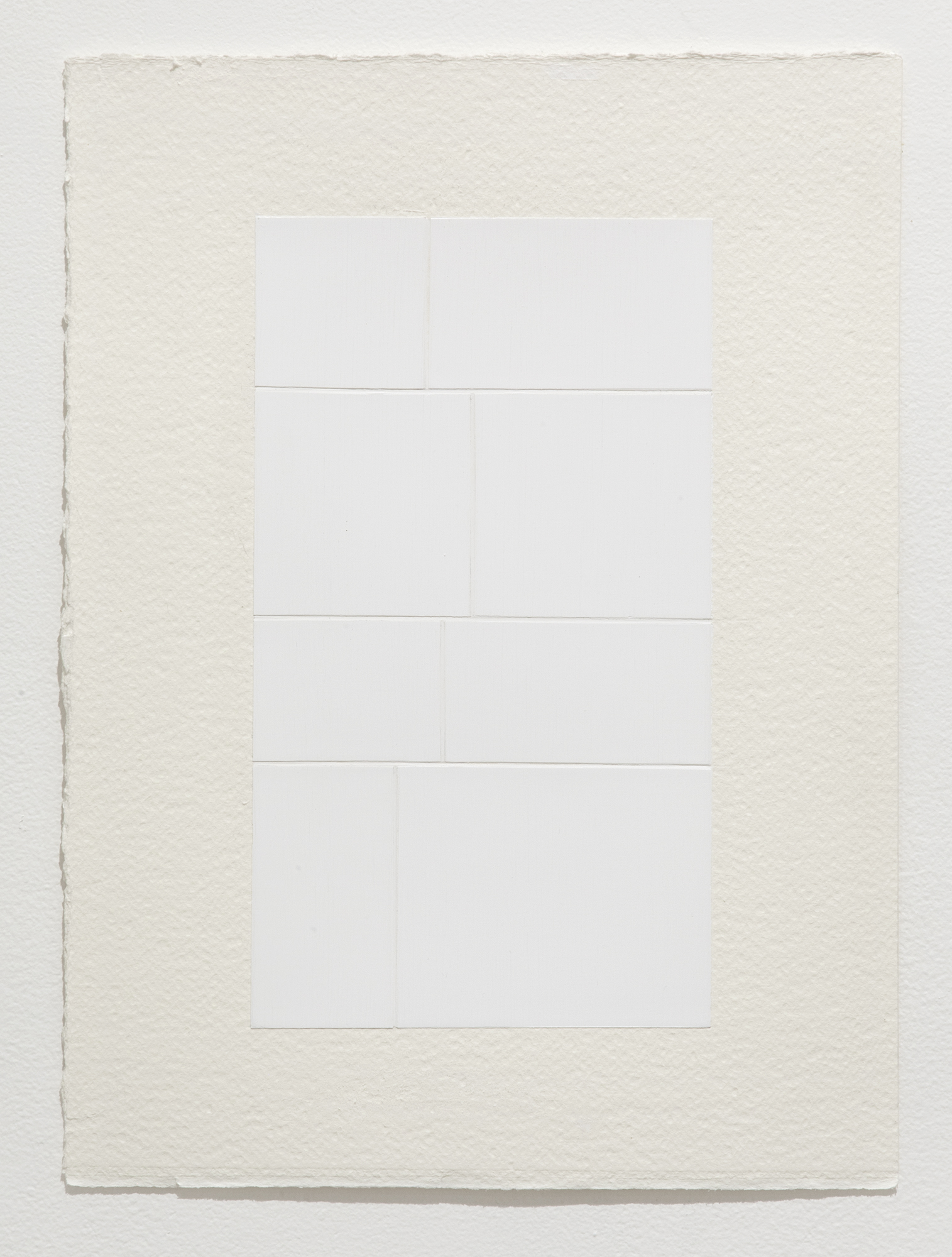
Intervals
Project Archive
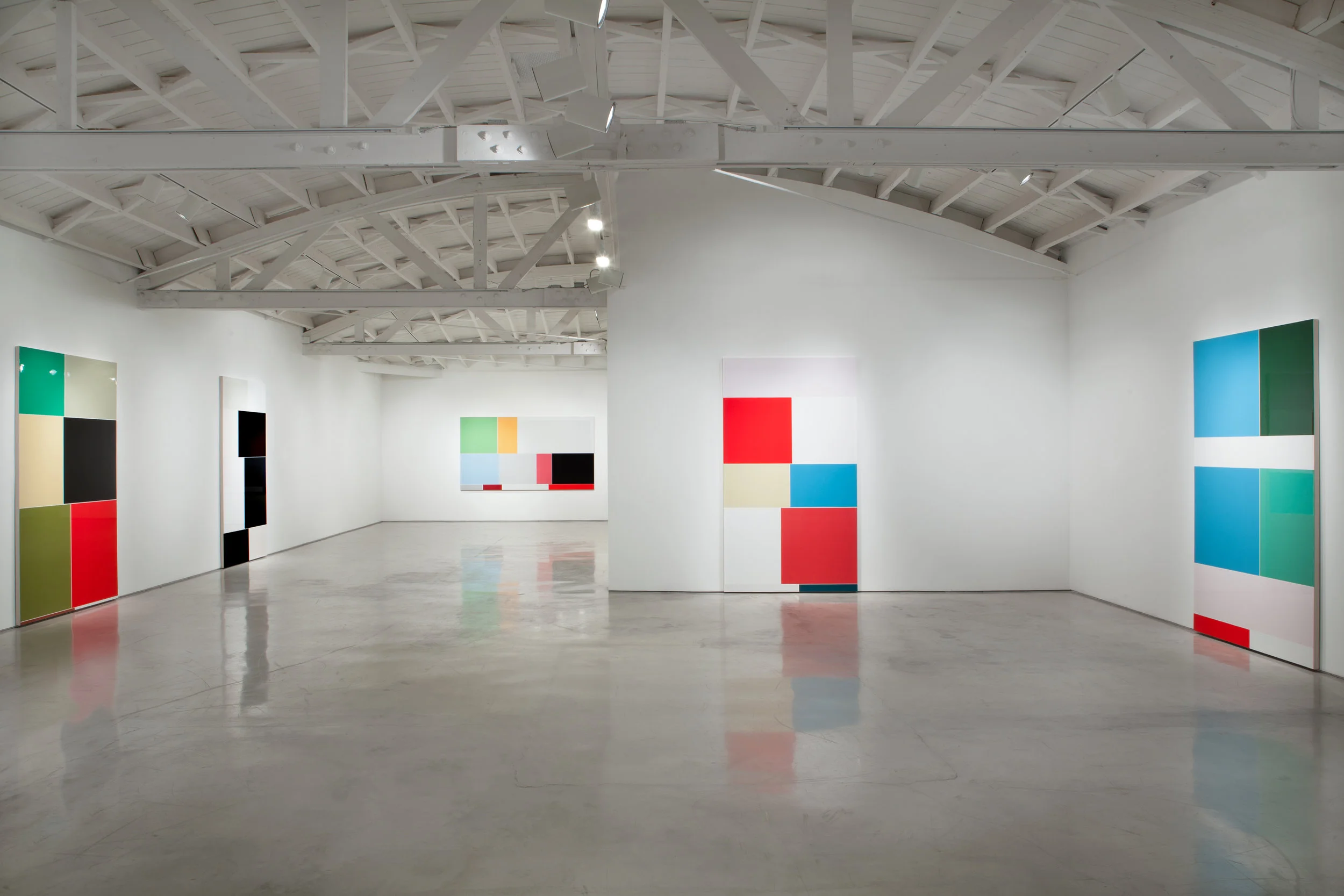
Installation view
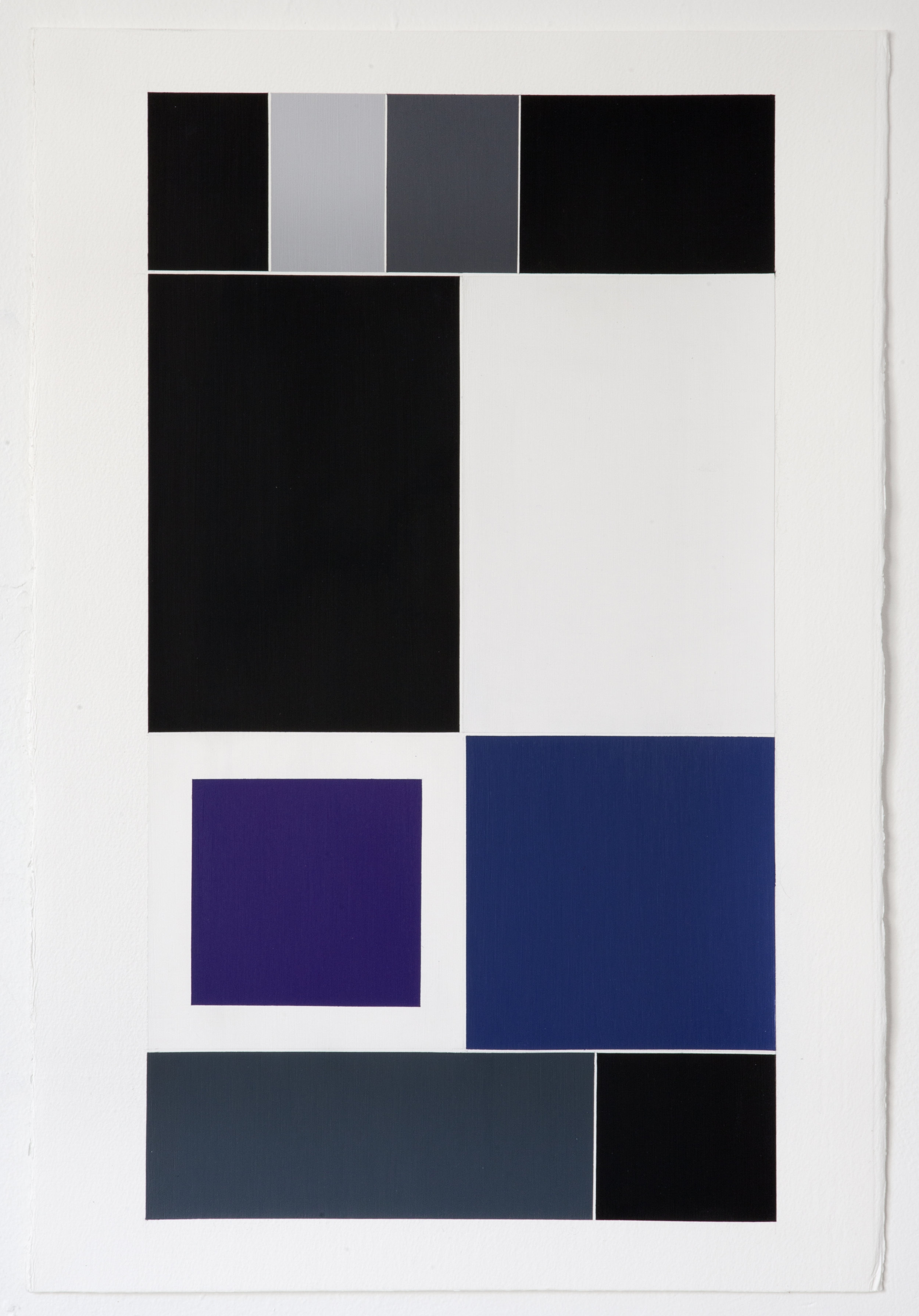
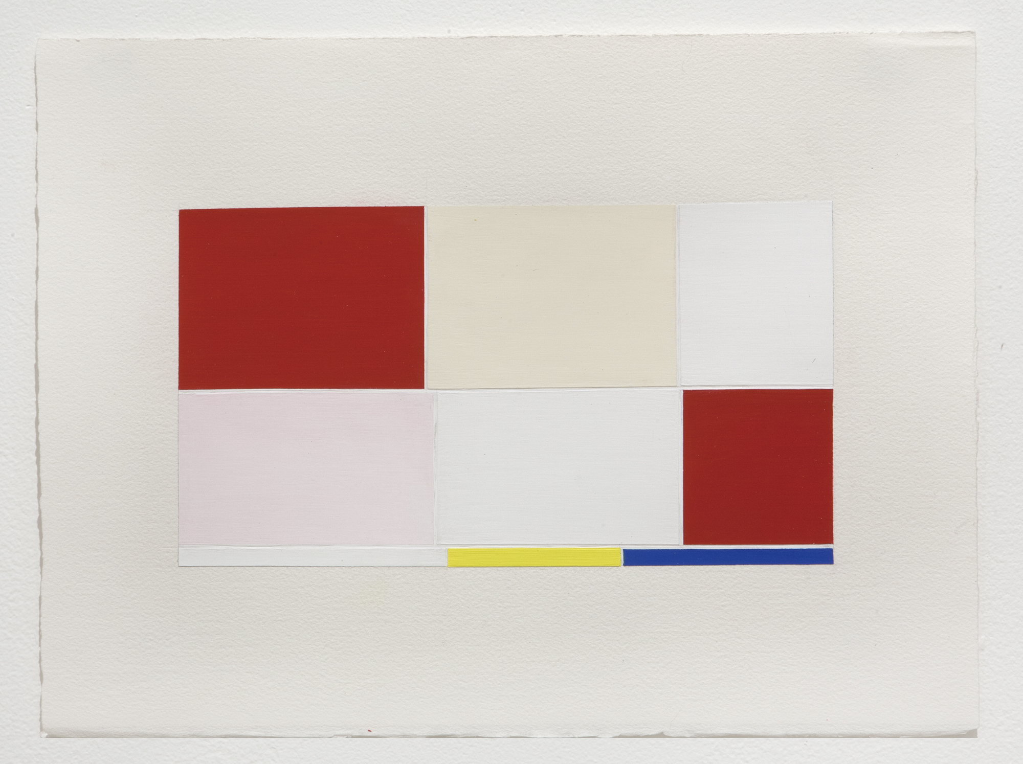
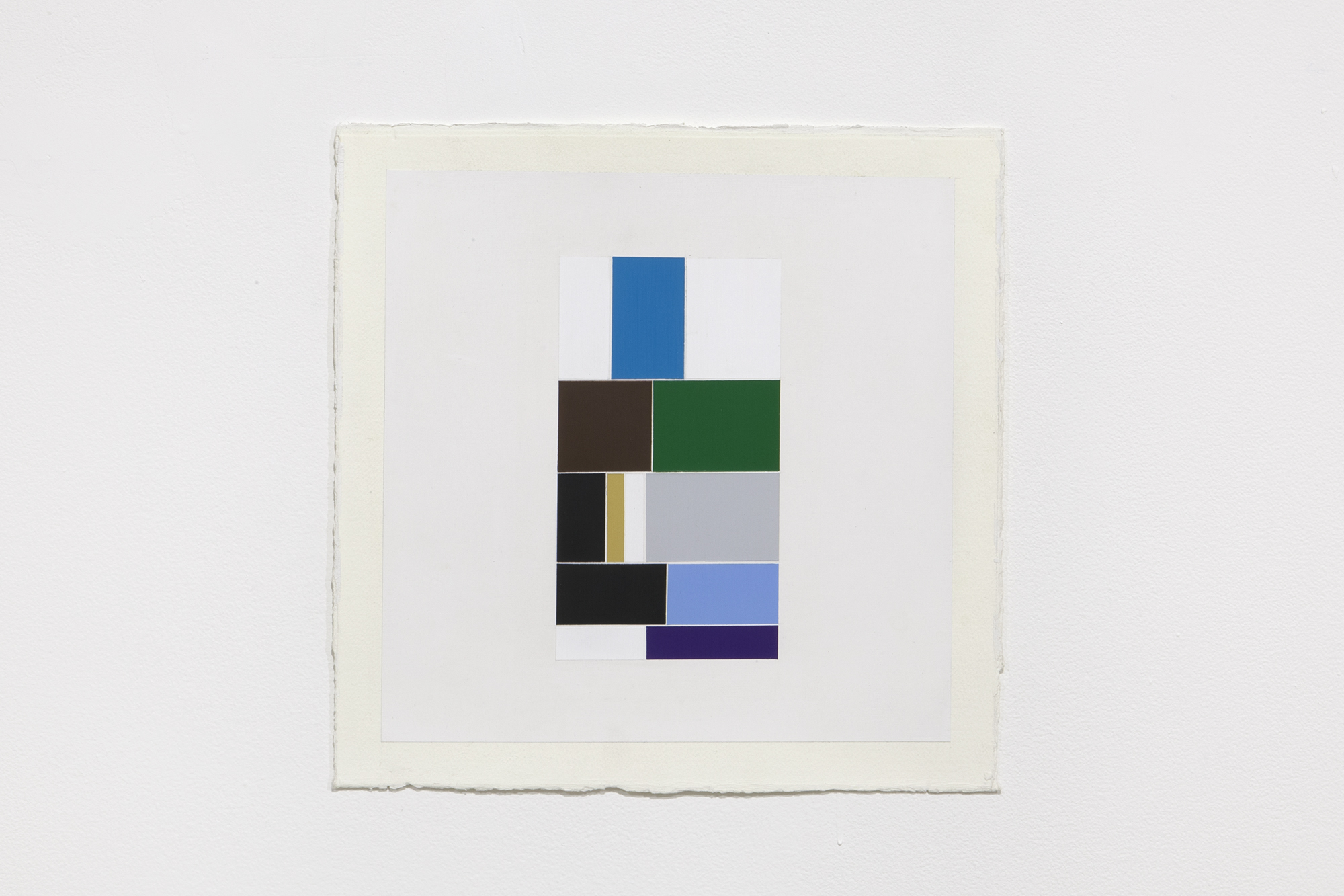
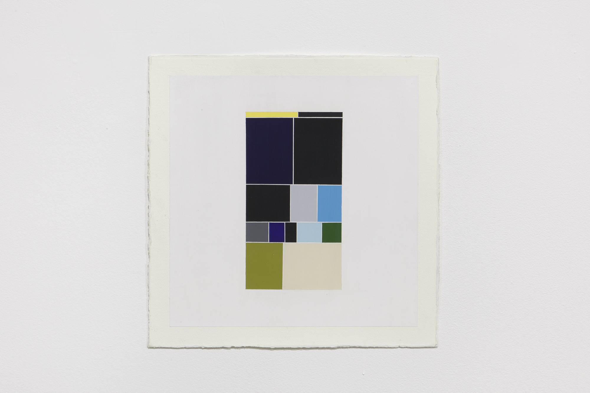
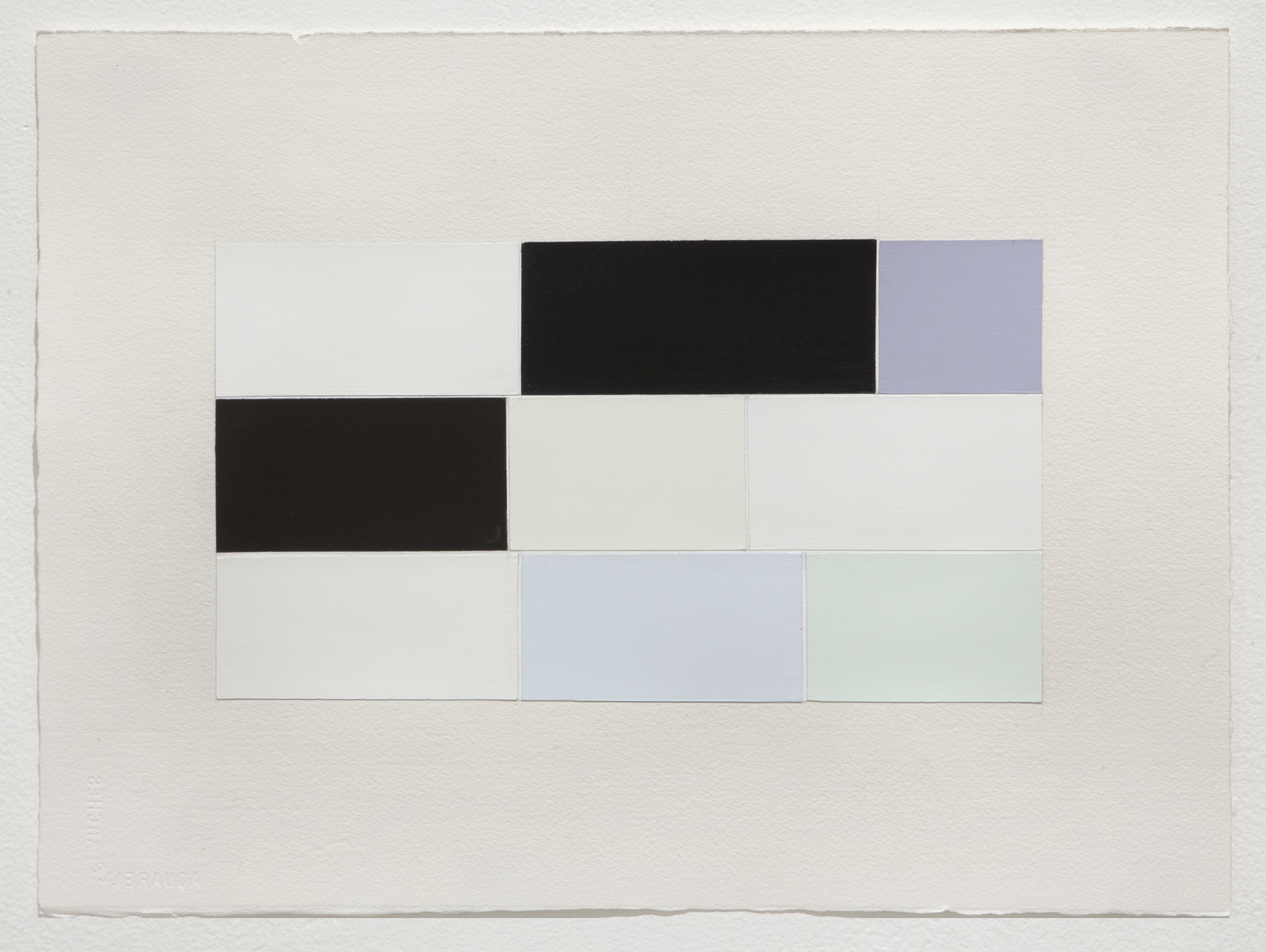
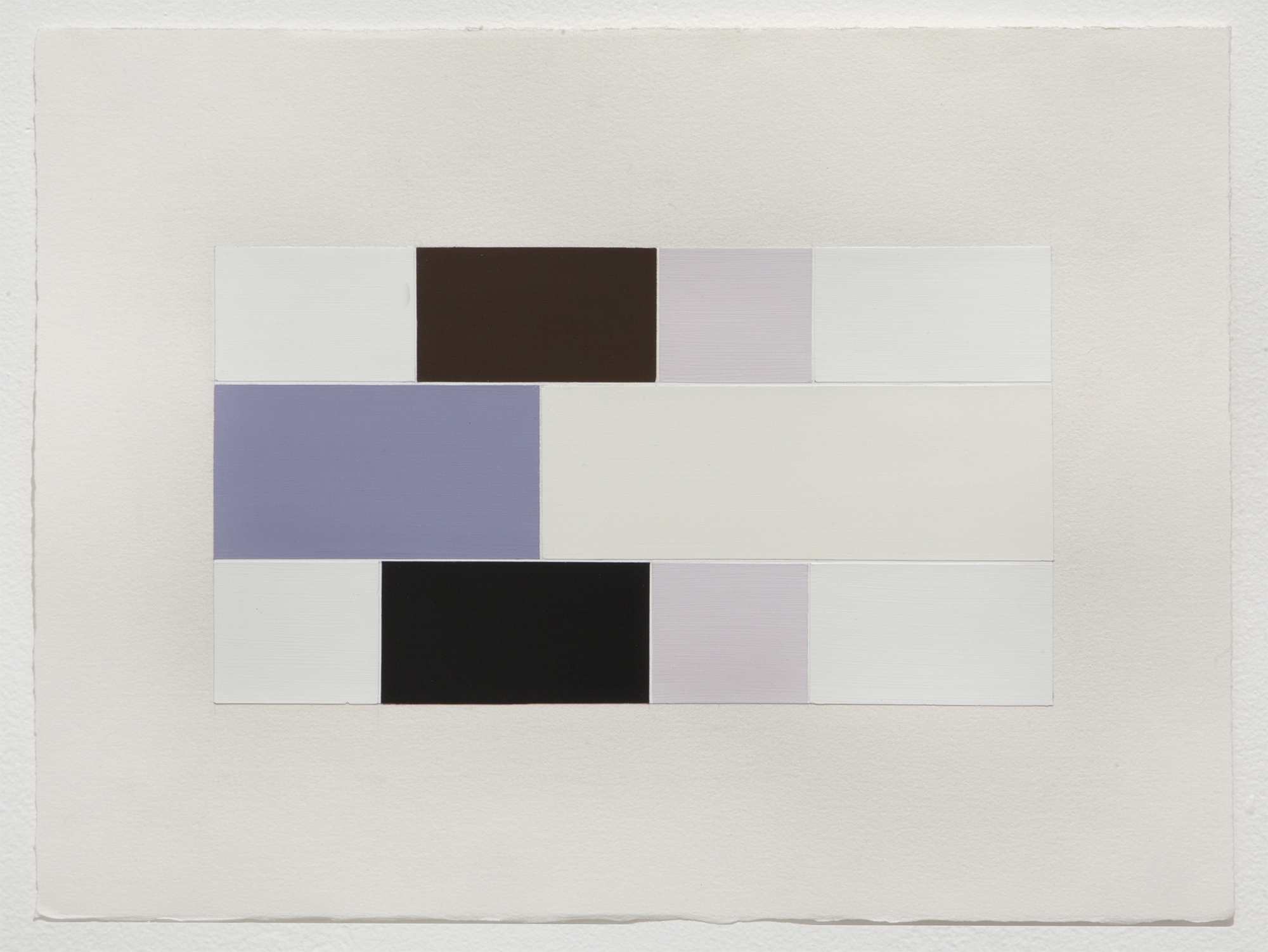
Moran Bondaroff is pleased to announce Michael Genovese’s third solo show with the gallery, titled Intervals. This exhibition presents a new body of work comprised of large-scale paintings of urethane on gessoed canvas, which visually derive from screen grabs of keyword image searches, specifically, the grid that briefly appeared while images were loading on his mobile phone. Proportionally scaled to the screen ratio, these paintings replicate the exact color and pattern that occurred during each image query interim. For over ten years, social practice and archives have remained an active interest for the artist, as he has worked through various methods and diverse pursuits toward accumulating material.
In this instance, Genovese used a macro approach to amass content, revealing that a broader source yields a more abstract result. Each piece in the Interval series images a minimalist version of simulacra. The artist re-created original artworks appropriated from digital substitutes for representational images – compositions that are now hyperreal, and subsequently truthful, in their own right. He permanently suspended algorithmic artifice by identifying these search- engine thumbnail placeholders as aesthetic illuminations.
Searching words like “hesitation” or “guilt” became concepts within these split seconds intervals, where he beheld sophisticated hybrids of color theory and pure abstraction in the least expected place, on the plainest plane, during a fraction of a seemingly incidental instant. Through a rigorous and technically involved process, these paintings canonize anticipation. Genovese exalts the expectorant moment, recognizing that the pause before expectation often transcends the expected outcome.
Today, any moment or thing can become decisive (as trend, fashion, crowd sourced, etc.) provided it is supported through the appropriate media channels and public platform. And as is also well known, such instants die out as quickly as they are made. Easy come easy go. And this is precisely what Genovese has brought into focus by transforming a set of exceedingly banal passing moments––moments not meant to be noted let alone reflected on––into frozen and static paintings, immortalized in time. Put differently, by aestheticizing the most vernacular slice of the infrathin, Genovese brings into resolution the pervasive ways in which our high-speed culture privileges nothing and values reflection even less. As artists, thinkers, or cultural producers, it is our responsibility to reevaluate such cultural throwaways, even if only to restore a much-needed pause in the nonstop march to greater and greater acceleration. (Excerpt from Carolyn Kane’s essay, Bridge Time) Paintings →
ArtReview
Larry Wilcox | pg. 115

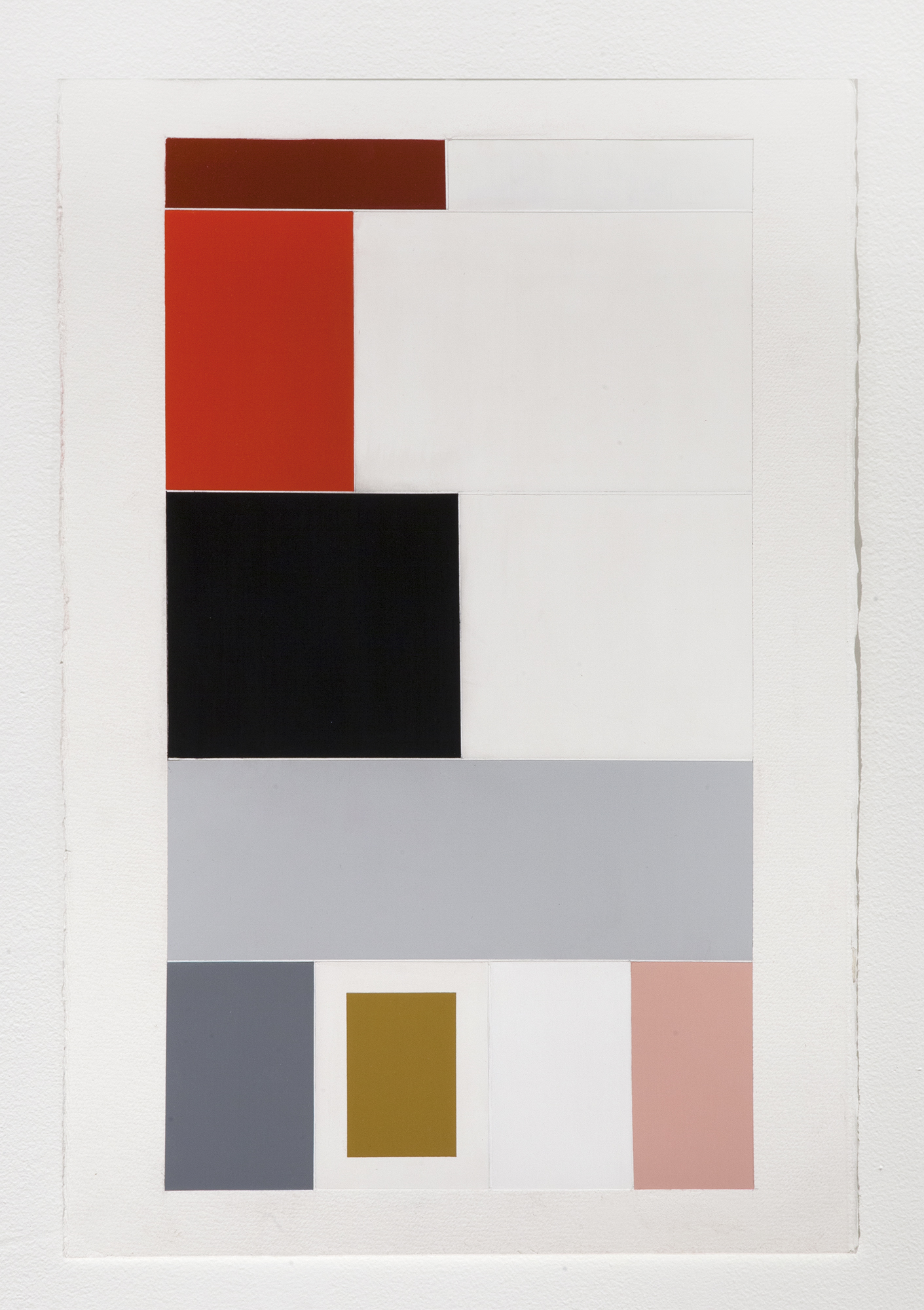
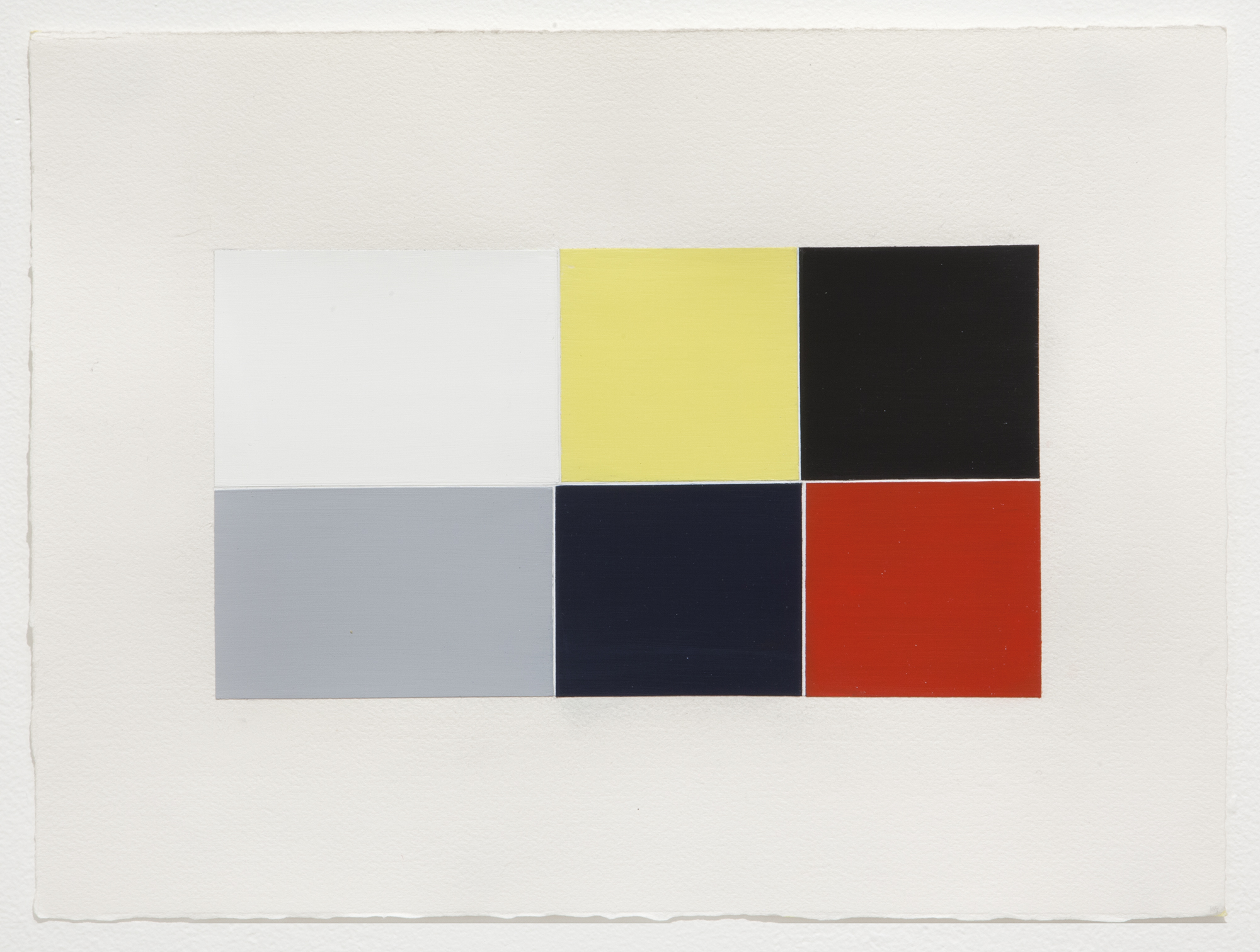
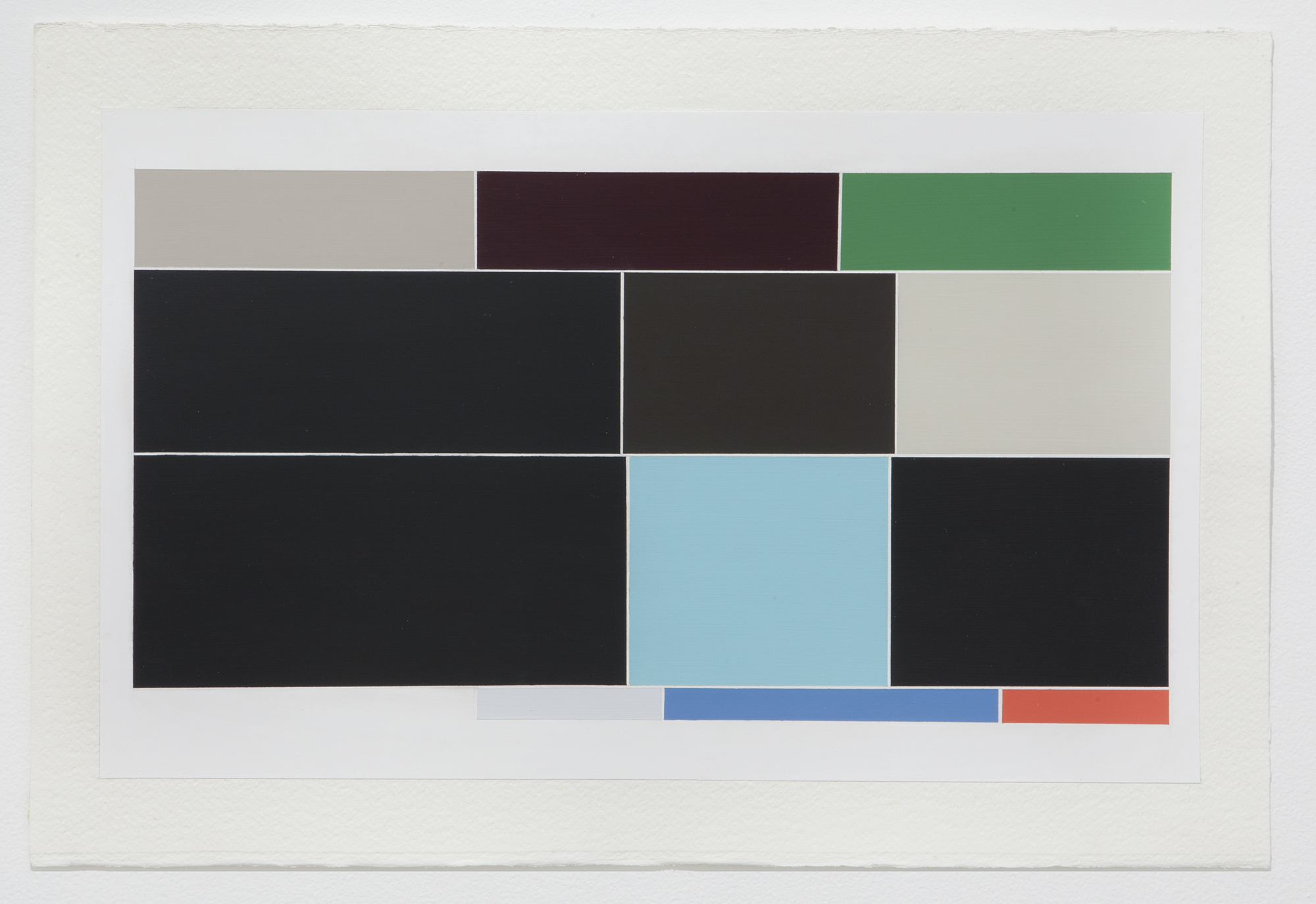
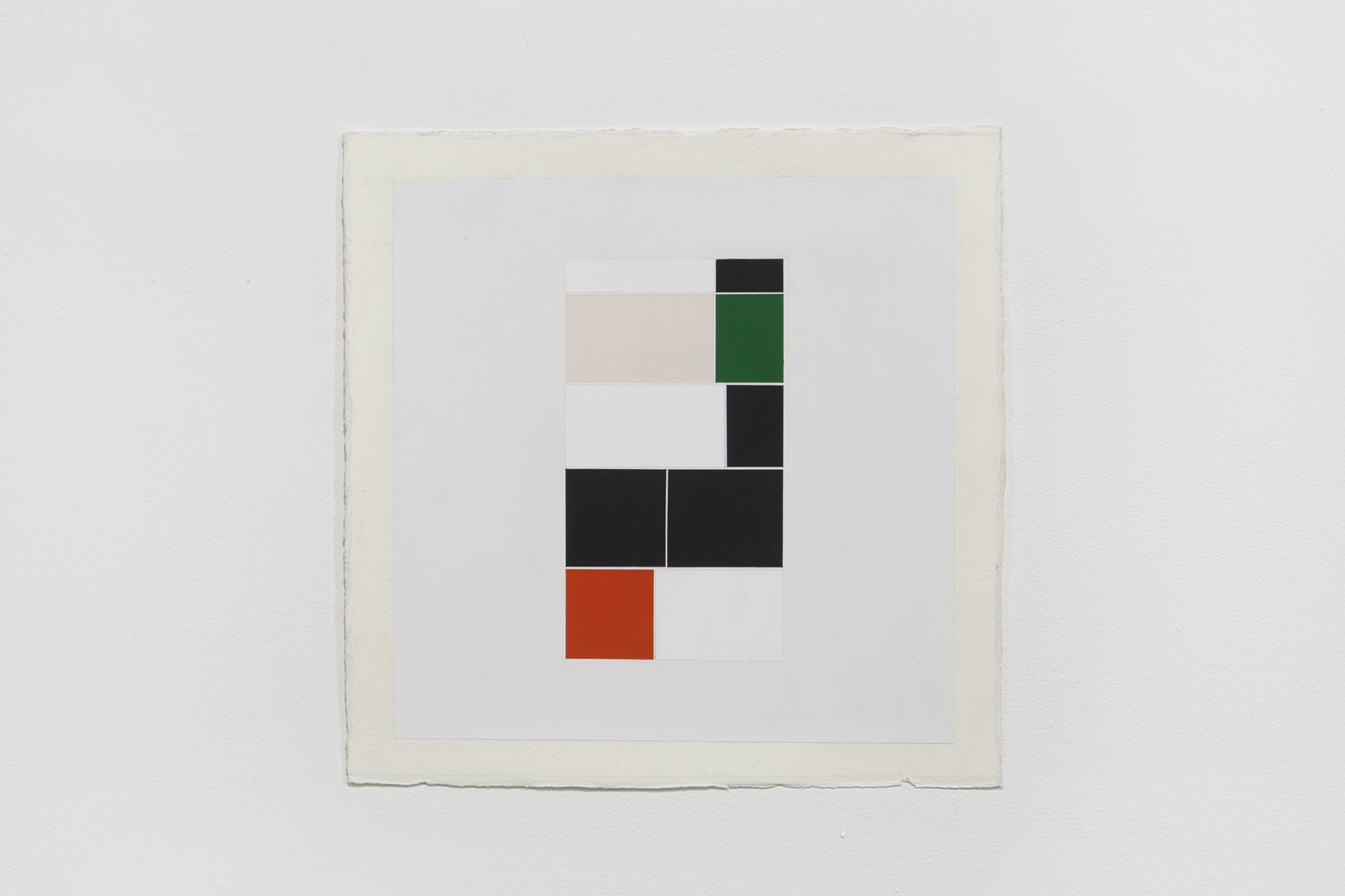
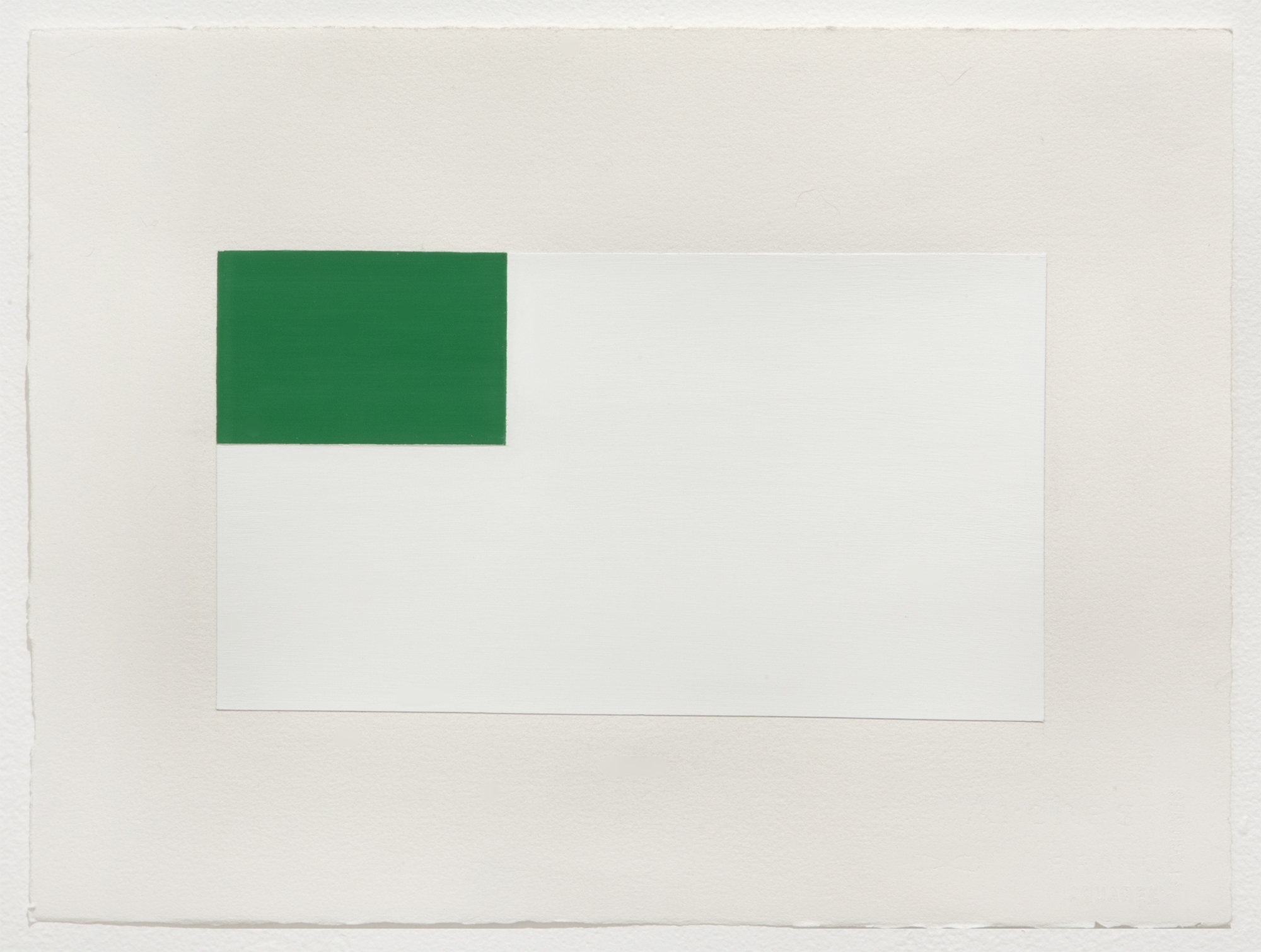
Google image search: Guilt, Gesso and polished urethane on cotton canvas, 96 X 56 inches
When the Dallas Museum of Art installs its Piet Mondrian collection, the result is illuminating. The museum has enough work, made over a long enough period of time, to allow one into the artist’s head, to see his particular form of pictorial reduction. In the world of popular Mondrian (in which his work is found on coffee cups, cupcakes and Yves Saint Laurent dresses), it is easy to forget the moody plein-air roots of the artist’s blocks of color and black lines. Mondrian painted liminal moments, when the fading sun threw dark shadows and stark contrasts across a row of trees. Analysing moments of transition or in-between spaces was how Mondrian attempted to show the structure of vision.
Michael Genovese’s new paintings recall Mondrian: they offer the grids of colour, perfect surfaces and hard-edge look that made Mondrian a force not only in art but in design. However, Genovese’s grids do not derive from the crepuscular, but instead from moments of transition found online. Specifically, he finds his abstractions through a Google Image search algorithm, which fills (only for an instant) a browser grid with blocks of colour just prior to the full loading images. The result is a momentary abstraction, a visual stand-in for whatever topic that brings a person to Google. If one’s computer has a fast connection, this intermediate Google space may be impossible to see altogether.
Using a screenshot, Genovese matches the color of the grid exactly. The searches that he uses to produce the the colour grids from Google are suggestive and romantic on purpose; words like ‘guilt’ and ‘pessimism’. Genovese paints the resulting grids on canvas, using accumulating layers of gesso and urethane until the surface is flat, pristine and glossy. The vertical works are slightly larger than a door and installed close to the ground; they are human scale, large enough to contain a viewer in their space. As evidenced by Elation (2016), the paintings offer a sober view of their subject matter. The colors seem pleasingly matched no matter whether the search was for ‘astonishment’ or ‘rage’.
What are these paintings? On one hand, they are the straight-ahead depiction of by-products of a system that is attempting to accommodate a contingency in its interface (the fact that the Internet’s speed is determined by a number of hard-to-reconcile variables). On the other hand, the paintings are metaphors and equations for life (and it’s possible expression in systems), in the same vein as a Mondrian, Peter Halley to Terry Winters.
In showing the structure of trees and nature, Mondrian hoped to offer a view the absolute. In showing a slice of the Google method, Genovese offers something else. He shows, poignantly, how the complex and the ragtag quality of existence is forced into and altered by the interfaces used to understand it. These are precise and surefooted colours, answers to riddles of ‘guilt’ and ‘pessimism’ on the order of Deep Thought’s ’42’.
Bridge Time
Exhibition Essay by Carolyn L. Kane

Installation view
These days no one has time to wait. Spare seconds, minutes, let alone half-hours and 45-minute sessions have become increasingly expensive in our high-speed, high-resolution, pay-per-download Wi-Fi culture. Everything must be NOW or it risks being at all. At least this is the ideology ushered in through e-commerce, mass media, and corporate capital.
But bridge time does exist. This is the in-between time that stitches together those almost imperceptible instants and forgotten thresholds of passing, segues, and crossovers. In the human world, bridge time is walking across the office, crossing the street, or waiting for someone to answer your call. In the world of computing, bridge time involves downloading, processing, saving, storing, encoding and decoding, transmission, and mass dissemination. In fact, there is a significantly grotesque amount of bridge time in the world of “high-speed” computation. Hi-tech industry may not want us to take much notice of the ubiquity of these in-between states, but they are there, and they are also the key to developing a richer understanding of ourselves and the culture we live in.
Marcel Duchamp identified the importance of such bridge time moments over a century ago, in his articulation of the “infrathin.” For Duchamp, the infrathin were states that, in the context of an artwork, invoked an immeasurable interstice between two ideas in constant transition or negotiation. Circa 2016, Los Angeles-based artist Michael Genovese has appropriated similar bridge time moments, illustrated in his recent series of paintings, Intervals.
At first glance, Genovese’s large-scale Intervals appear to have nothing to do with ambivalence, uncertainty, or the threshold of conceptual space invoked by the infrathin. Rather, his clean-cut, precisely executed, unanimously square and rectangular shaped pictures seem to belong to the straightforward genre of traditional color field paintings, rendered according to the conventions of minimalism and the pre-established dictates of modern art. And yet, while they appear to sing this same well worn “song,” as the artist puts it, they do so using “a different story.” But what story of ambivalence or indecipherable uncertainty could static color field paintings have to tell, circa 2016?
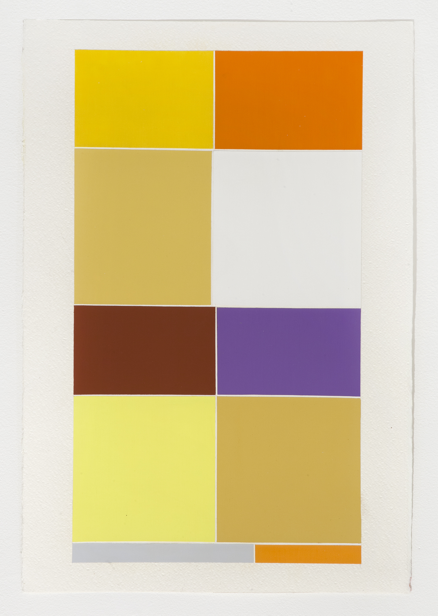
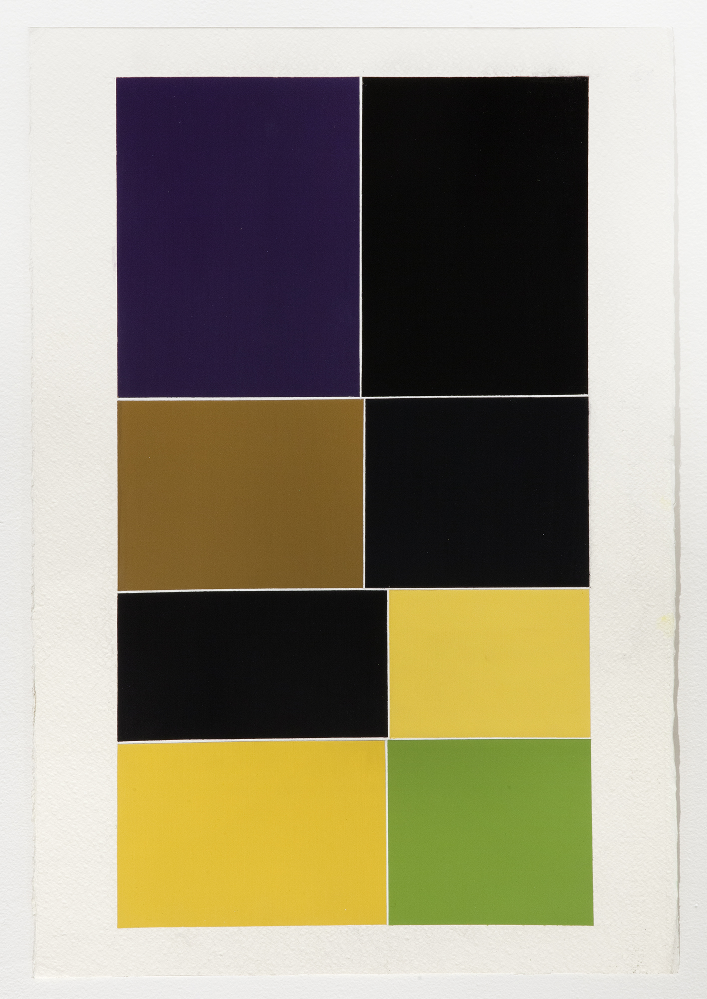
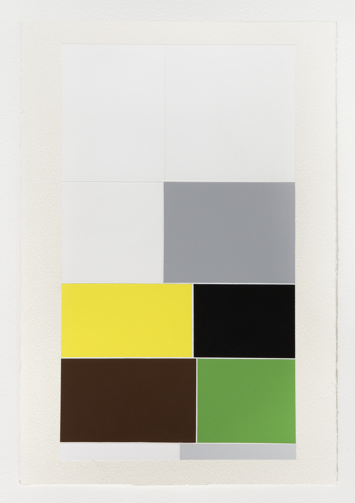
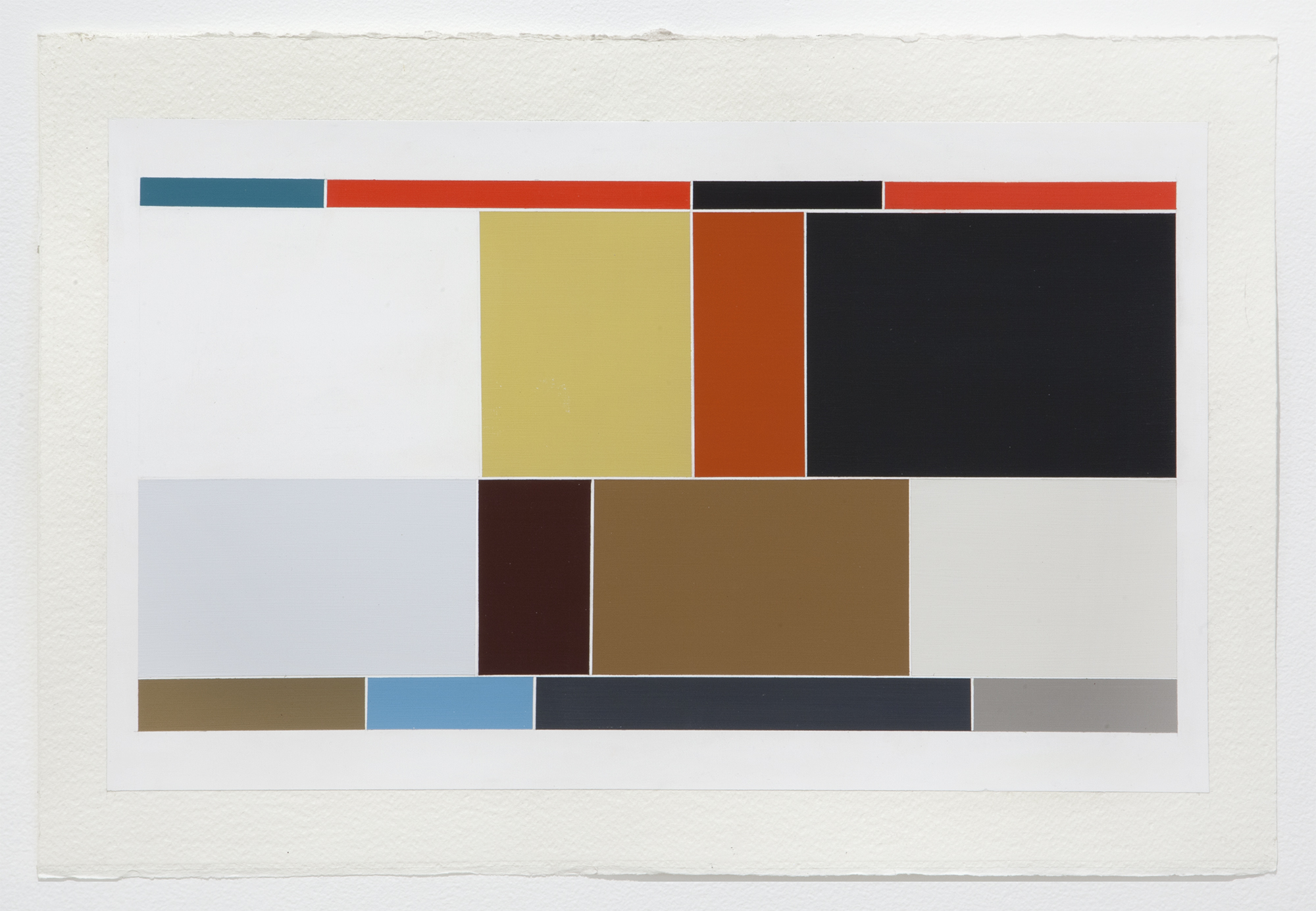
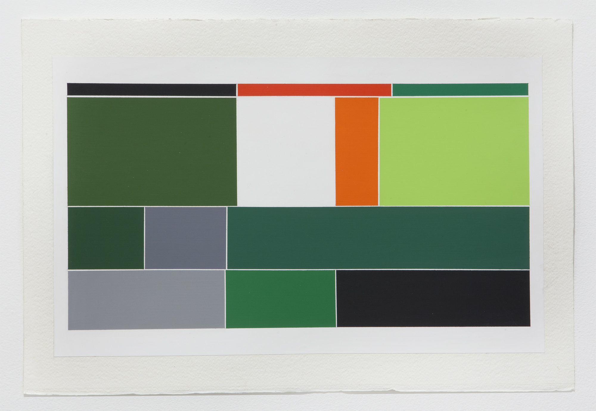
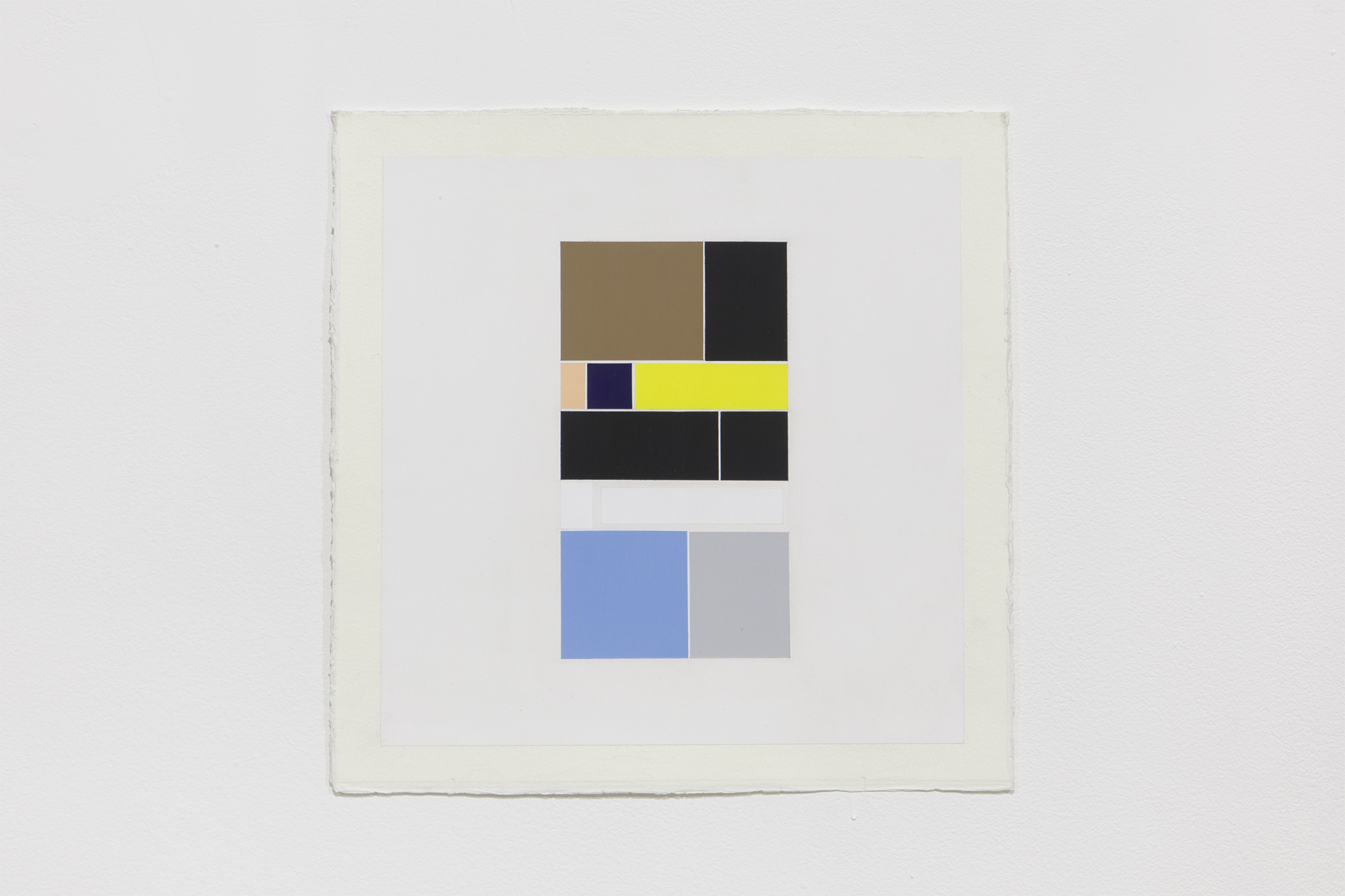
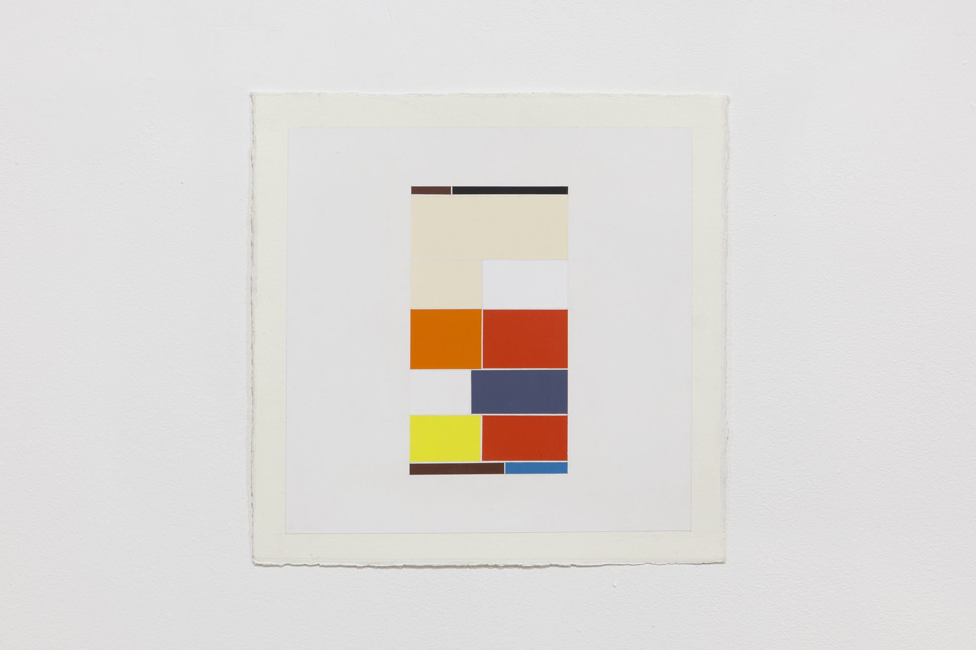
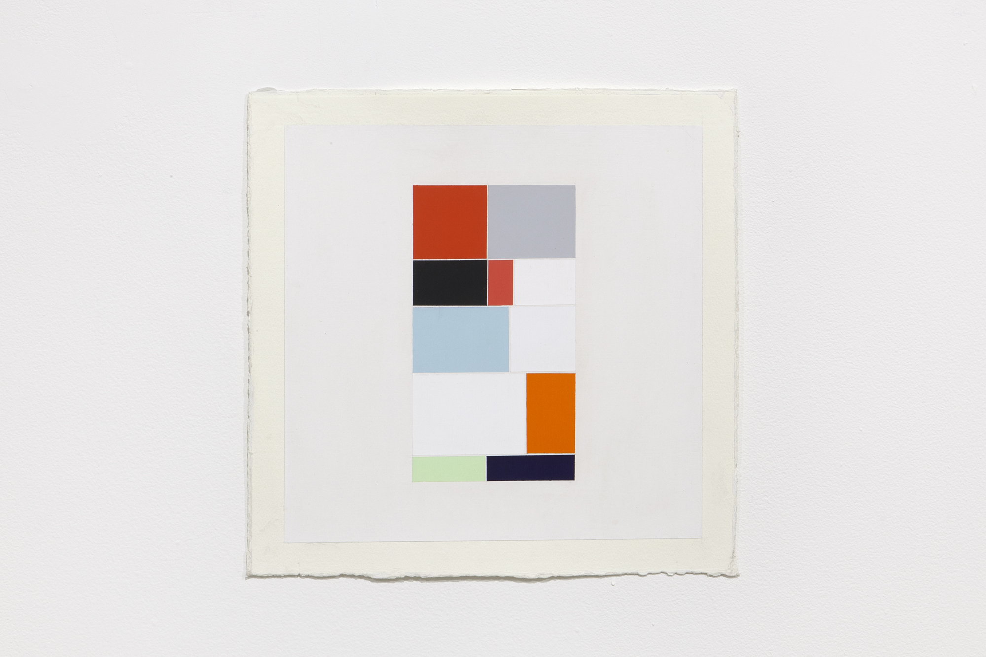
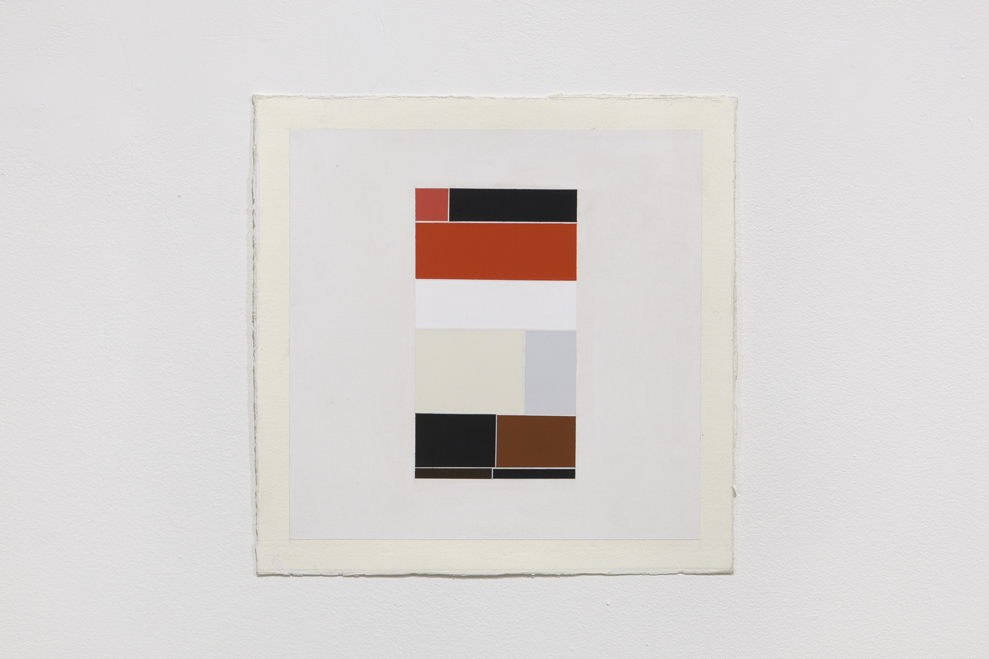
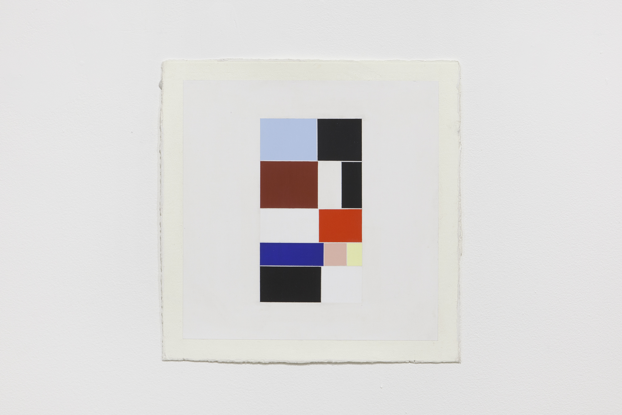
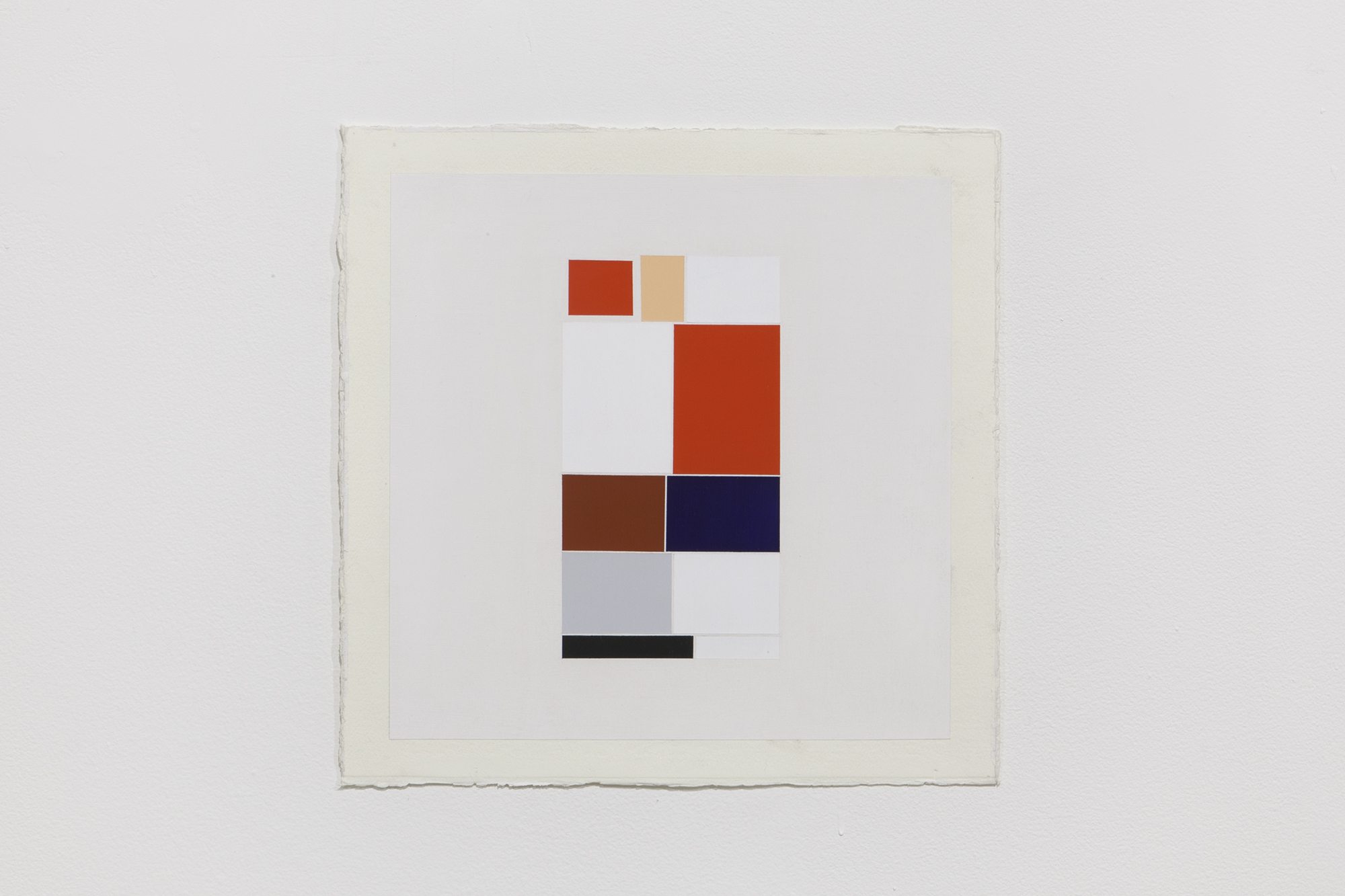
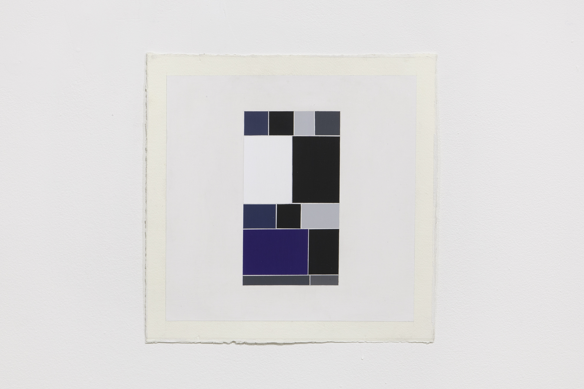
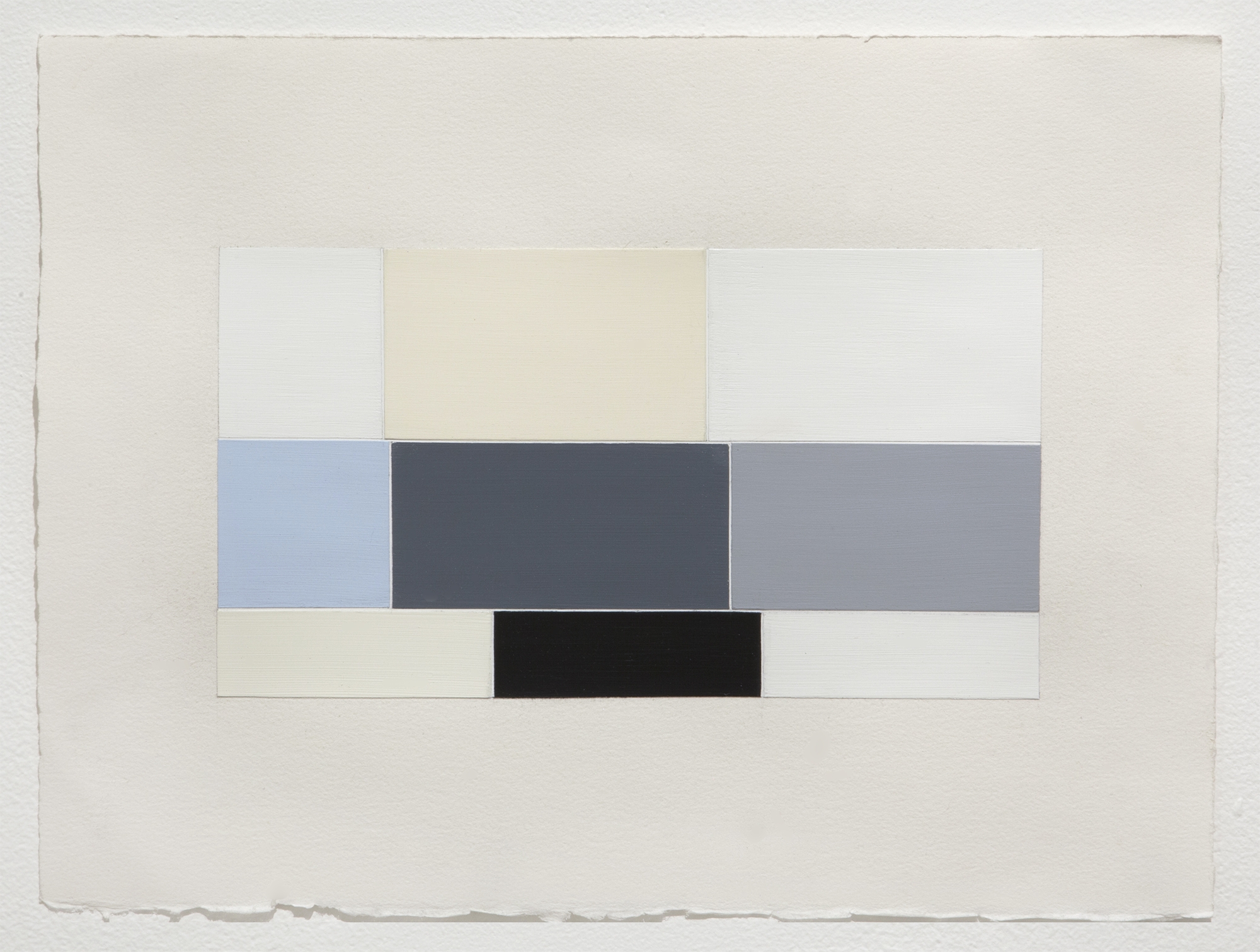
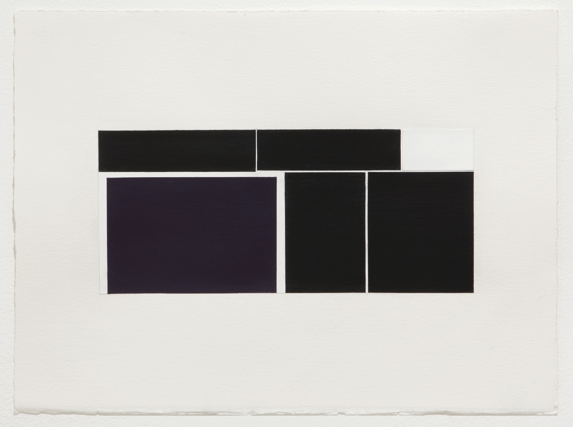
Already the suggestion of a story with its correlative set of interpretive meanings wreaks havoc on the tradition of modern flatness and militant anti-signification. But the bigger breach comes with the artist’s color choices. Instead of the pure, primary hues favored by traditional color field painters, Genovese selects an offbeat set of hues running the gamut of pale blue, turquoise, muted magenta, burnt orange, and dirty yellow. The eclectic choices are especially evident in Interrupt (2016), Chasing After Wind 1 (2016), and Hichokshi (2015-2016) [Figures 1-3]. His color palette is not merely one step away from the red, yellow, blue, black, and white of a Mondrian, towards the sometimes secondary palette of blue-greens and red-oranges in a Rothko but instead a full-blown defiance of any color pairing principle from primary, secondary, and tertiary sets to tetratic, analogous, or simultaneous contrasts. In short, his palette offers no pre-established color order or system to classify it in. Moreover, in place of standard geometrically aligned rectangles and squares, neatly composed in a static grid (the modernist grid that Rosalind Krauss wrote so eloquently about), Genovese’s squares and rectangles are offset. Straight lines become bent corners and lines of sight fail to match up between color spaces. The sanctity of the grid is disturbed. Together, the combined effect of offbeat color and de-centered squares begs the question, why are these colors and these misaligned rectangles, placed together in this agitated yet meticulously polished composition?

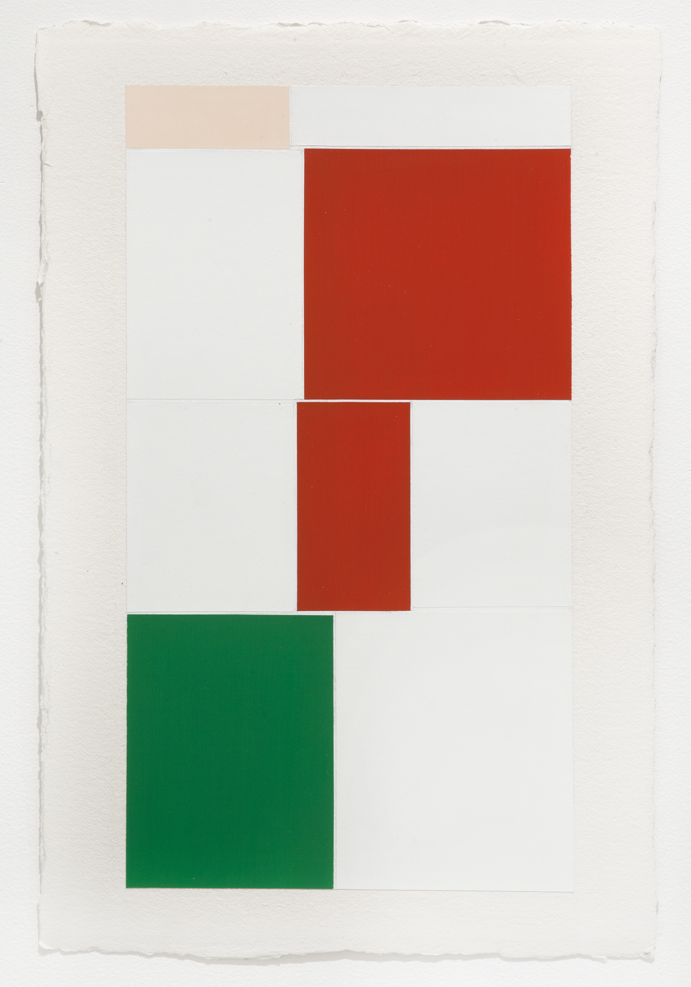
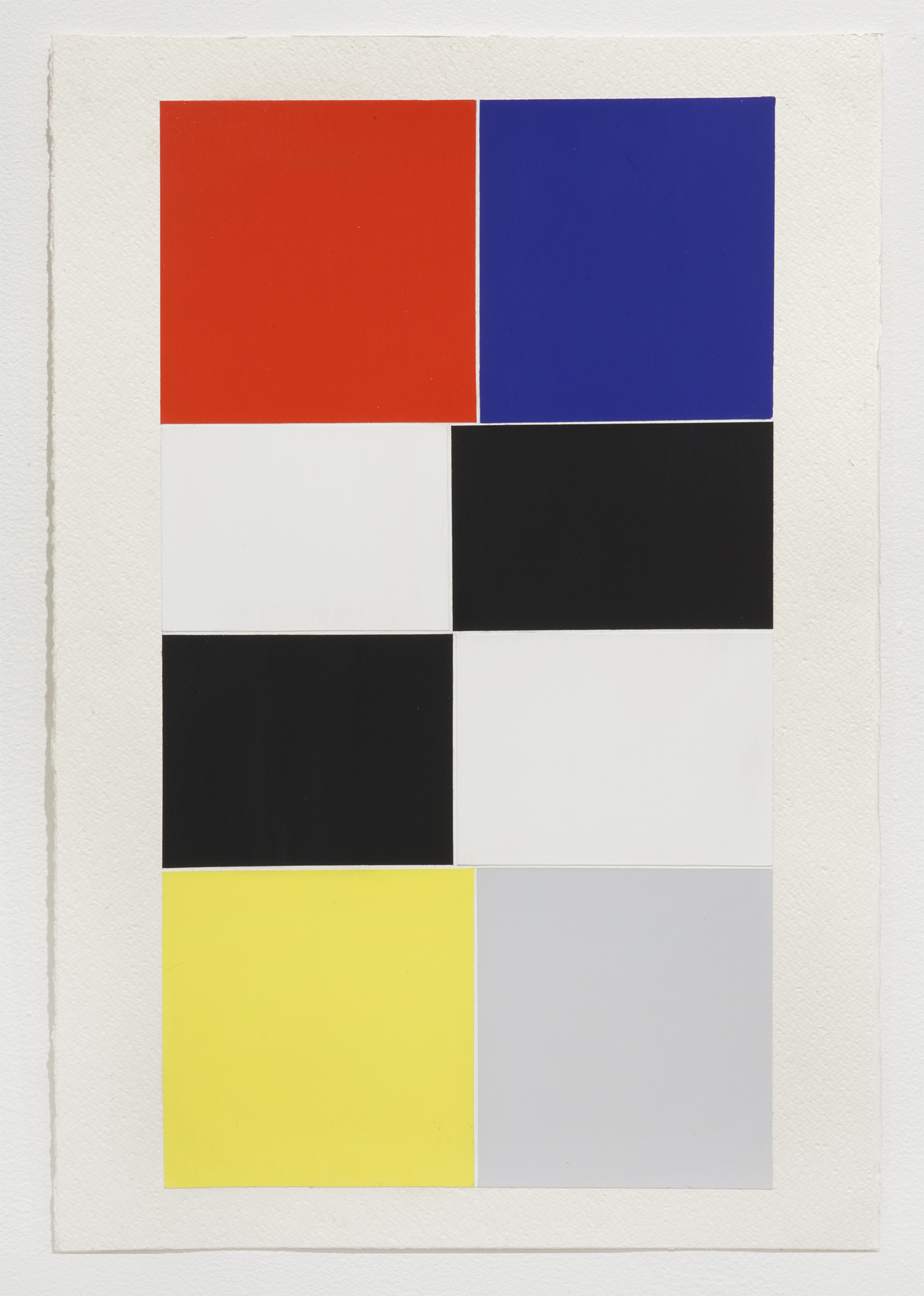
The story begins with a set of a screen grabs. Not just any set of screen grabs: 6,000 screen grabs captured by the artist from his iPhone interface while the operating system was in the process of executing an operation, retrieving data from the network to display on the iPhone. After entering a search term in the Google image query––sample queries employed single terms like “abandoned,” “elation,” “faith,” “pessimism,” “rage,” “guilt” or “astonished”––– the artist carefully captured a screen grab from the phone’s interface in the split second prior to it retrieving and rendering the full set of images from the database. What do these screen grabs reveal? Flat color fields loosely corresponding to the query. Red, pink, blue-green, and black appear for Rage; black, green, and orange appear for Guilt; an overwhelming amount of solid white with a dash of red appear for Elation; and light blue, white, and black fill the bridge time interval in the search for “Faith.”
The vast majority of people work hard not to pay attention to such intervals of waiting and socio-technologically imposed bridge time. It is also likely that the someone in some place like Silicon Valley who wrote the algorithm to determine which colors to return to which fields in which parts of the interface’s grid (in the condition that “X” term is entered into “Y” field) gave very little thought to the squares’ resemblance to a Rothko, Newman, Kelly, or Mondrian. For an artist attuned to the history of painting, however, raised on the unwavering canons of minimalism, color field painting, modern art, and industrial design history, one cannot help but see in them a strange set of collectively unconscious synonyms.
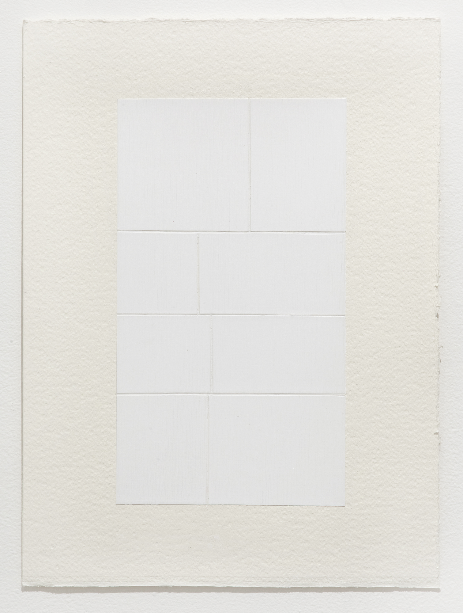
But even so, while one may make the leap and connect to the data interval to the color field tradition, which Genovese obviously did, when considering an appropriate subject matter for a large-scale painting, one would typically move on to bigger and better material (a beautiful object, an awe-inspiring landscape or some other such thing). Even the name “screen grab” suggests something impermanent and passing, not the kind of well-poised subject matter or noteworthy venue that inspires hours of painstaking polishing, scraping, and sanding that Genovese’s paintings were subject to. Beginning with 12-oz German imported canvas stretched on an aluminum frame, Genovese next applied 10 layers of gesso to make the surface flat after which he applied a single stage of polyurethane color. After drying, the image was further submitted to extensive sanding, polishing, and related techniques to make the surface appear “almost perfect” in its flat cold finish. The resultant surface is delicate ––“one tap of a corner,” he explains, “and it's over.” And yet, these seemingly inconsequential networked data intervals formed the fleeting moments that captured and sustained Genovese’s attention. Prolonged attention to nowhere instants of nothing in particular is far from the norm in the history of painting.
In the world of photography, things are different. The ephemerality of a passing moment is this medium’s stock and trade. The photographic camera can capture in a fraction of an instant a slice of life that in many ways remains off-limits to human perception. When the medium was introduced at the beginning of the last century, it posed a series of challenges to painting with its long-held hegemony on the aesthetic of sublime beauty and form. Photography spoke instead to a new sensibility rooted in speed and the massive changes brought about through modernity, urbanization, and the industrialization of culture through machine and industry.
German critical theorist Walter Benjamin captured the essence of the new machine aesthetic of cinema and photography in 1936 when he described the camera’s capacity to open up a different sort of nature than the one available to the “naked eye.” In photography, he explained, an Unconsciously penetrated space is substituted for a space consciously explored…Even if one has a general knowledge of the way people walk, one knows nothing of a person’s posture during the fractional second of a stride. The act of reaching for a lighter or a spoon is familiar routine, yet we hardly know what really goes on between hand and metal, not to mention how this fluctuates with our moods.
The new photographic media so spectacularly excelled in capturing the ephemeral moment that pioneering French photographer Henri Cartier-Bresson termed the phrase, the “decisive moment.” He had in mind that single ephemeral and escaping moment when something could be caught by the eye of the camera and preserved through history. First published in his book “Images on the Run,” Cartier-Bresson’s notion of the decisive moment shaped some of his most important work, including the notorious Place de l’Europe (1932), depicting a man about to land into a puddle of water and The Val de Marne 'departement' (1938), an image of a newly-wed bride and groom at their wedding party in Joinville-le-Pont, near Paris.
Cartier-Bresson describes the invaluable fractional-moment:
There is a creative fraction of a second when you are taking a picture. Your eye must see a composition or an expression that life itself offers you, and you must know with intuition when to click the camera. That is the moment the photographer is creative. Oops! The moment! Once you miss it, it is gone forever. His concept of the decisive moment has remained close to the history and practice of art, documentary, and journalistic photography throughout the twentieth century through the present.
One may be tempted to classify Genovese’s screen grab Intervals as just such Decisive Moments, but this would be a mistake. Things have changed in an era of Instagram and Pinterest. Decisive moments are no longer the exclusive domain of the sensational or rare spectacular event. Today, any moment or thing can become decisive (as trend, fashion, crowd sourced, etc.) provided it is supported through the appropriate media channels and public platform. And as is also well known, such instants die out as quickly as they are made. Easy come easy go. And this is precisely what Genovese has brought into focus by transforming a set of exceedingly banal passing moments––moments not meant to be noted let alone reflected on–––into frozen and static paintings, immortalized in time. Put differently, by aestheticizing the most vernacular slice of the infrathin, Genovese brings into resolution the pervasive ways in which our high-speed culture privileges nothing and values reflection even less. As artists, thinkers, or cultural producers, it is our responsibility to reevaluate such cultural throwaways, even if only to restore a much-needed pause in the nonstop march to greater and greater acceleration.
Author Bio
Carolyn L. Kane is the author of Chromatic Algorithms: Synthetic Color, Computer Art, and Aesthetics after Code (University of Chicago Press, 2014), an award-winning book analyzing the role of electronic color in the development of media aesthetics 1960. After completing her Ph.D. at New York University and a Postdoc at Brown University, she joined the Faculty of Communication and Design at Ryerson University in Toronto.
Know Wave Magazine
Conversation w/ William J. Simmons | Volume 2
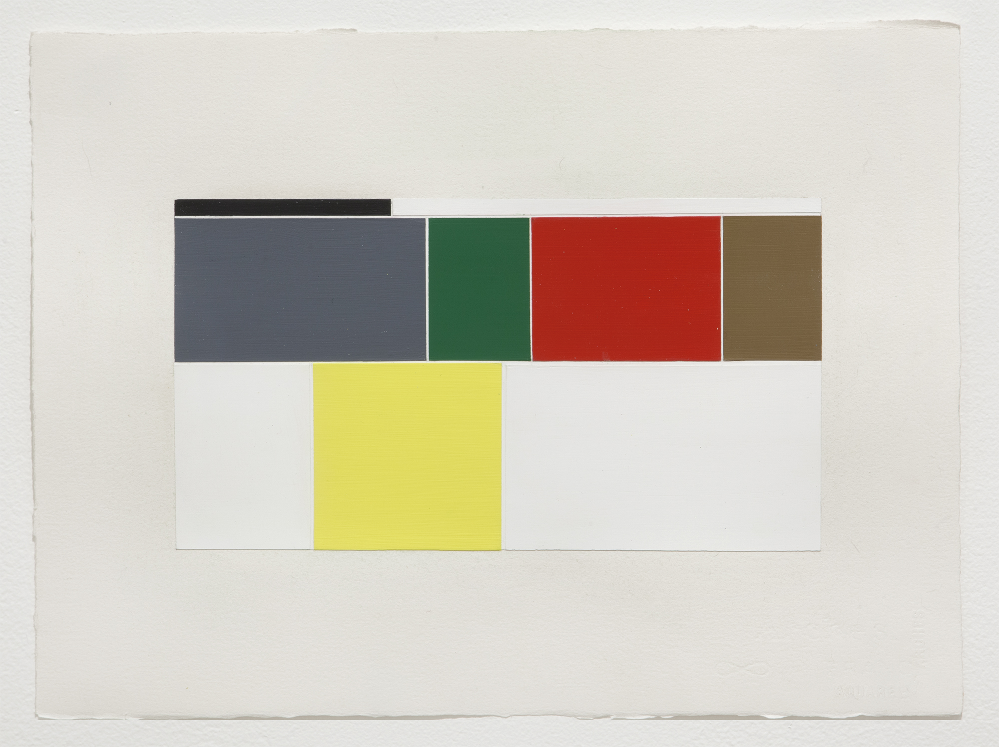
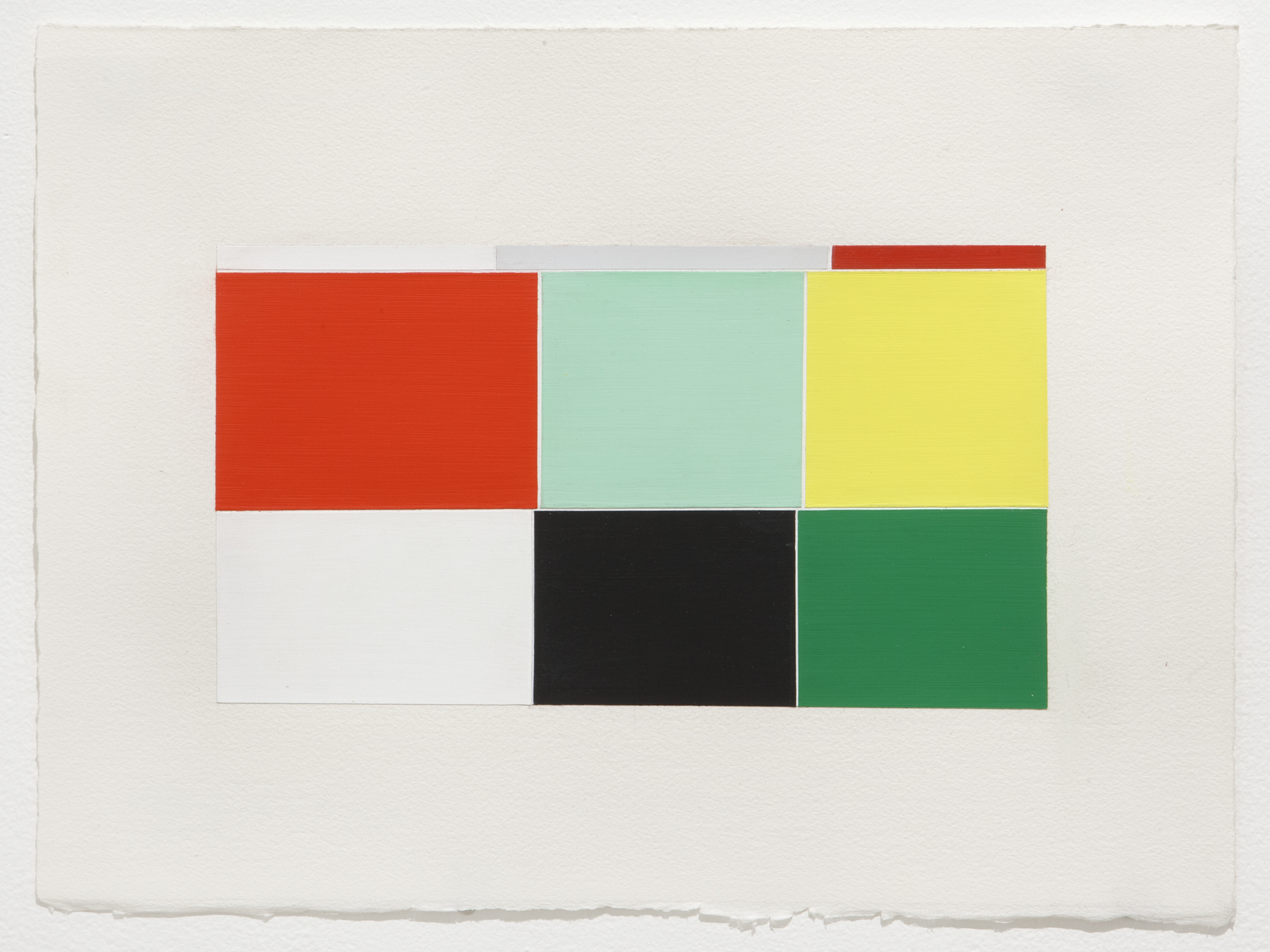
Google image search: Confessions, Gesso and polished urethane on cotton canvas, 96 x 56 inches
WJS: So, after much research, I have established that you are, in fact, an artist, and not the Pittsburgh mob boss. With this out of the way, let’s get started. These new paintings seem to stem from your interest in collaborative artistic practice within the public sphere, especially your work at the Frost Art Museum, yet there is an entirely different mode of information gathering taking place.
MG: OK, but let’s get to this first. Right, I faced a set of problems with that project. There are thousands of comments, drawings, and conversations from around the country, which were transcribed, that I’ve been left to deal with. I’m using that information as source material to see how the subject matter can develop, change, and morph by way of researching images online. The initial results were images that didn’t correspond correctly to the terms, but came up due to other embedded information within the file source. Algorithmic color-coding is an unseen component of the image as it loads, and that’s what led me in this direction.
WJS: I love the idea of the “unseen,” as this is exactly what you are doing – you’re mining color that is only visible for a few moments from the text you are searching. In this way, you are getting at some kind of interior space, that may not be initially legible, on what looks like highly polished, hard-edged abstract paintings. After all, the origin of abstraction was exactly the search for something that is perpetually unseen – a universal language, some sort of expression without speech that transcends culture, and enters the realm of the spiritual. The other component of the “unseen,” however, is an element of control. Even the most minute experiences we have on our phones are regulated. Is there something nefarious latent in your project? I’m reminded of that very famous Barbara Kruger image/book Remote Control (1994). There is also a connection to Sarah Charlesworth’s Modern History series, in which information and socio-political relationships become reduced to formal relationships.
MG: I’m looking for that quiet and undefined space between information, and what you refer to as the interior space – that flawed moment in translation, color, and order, right before it fails. Charlesworth’s Modern History series is a perfect example. In that work, the entire written context was removed, leaving you with just a stark black and white image, with a floating set of editorial photos, and a header. By way of redaction, you were faced with drawing your own conclusions from the void. These are similar in that way, though the cues of information are further removed to set up issues with context, color, and perception. Deception isn’t designed into the image, but if a painting is contextualized with a provocative title, for example Stereotypes or Faith, the viewer is bringing their history of the subject to the image, and it can be construed as subliminal.
WJS: Since you bring up the inherently flawed nature of these images, and their intensely personal nature, I think this is a great place to consider the sense of longing I see in these paintings. Just when you think lines are going to connect, or at least create something formally sensible, things fall apart. To quote Yeats, via Achebe: the center, indeed, cannot hold. This off- kilter sense of order bespeaks an urge for unity, for completion (I use this word advisedly, with all its connotations), for some sort of resolution.
MG: The paintings are based on the time in between the search and the resolution. The idea of waiting is what I’m working with, where something concrete has previously happened while in a state of pause before another tangible situation occurs. Similar to the format of our conversation, the time intervals between responses – the thoughts that appear and disappear as time lapses. It can be as aggravating as it is welcome. It's imbalanced and unresolved, with a will to connect to a collective unconscious.
The Monocle-Arts Review
Francesca Gavin | Episode 215

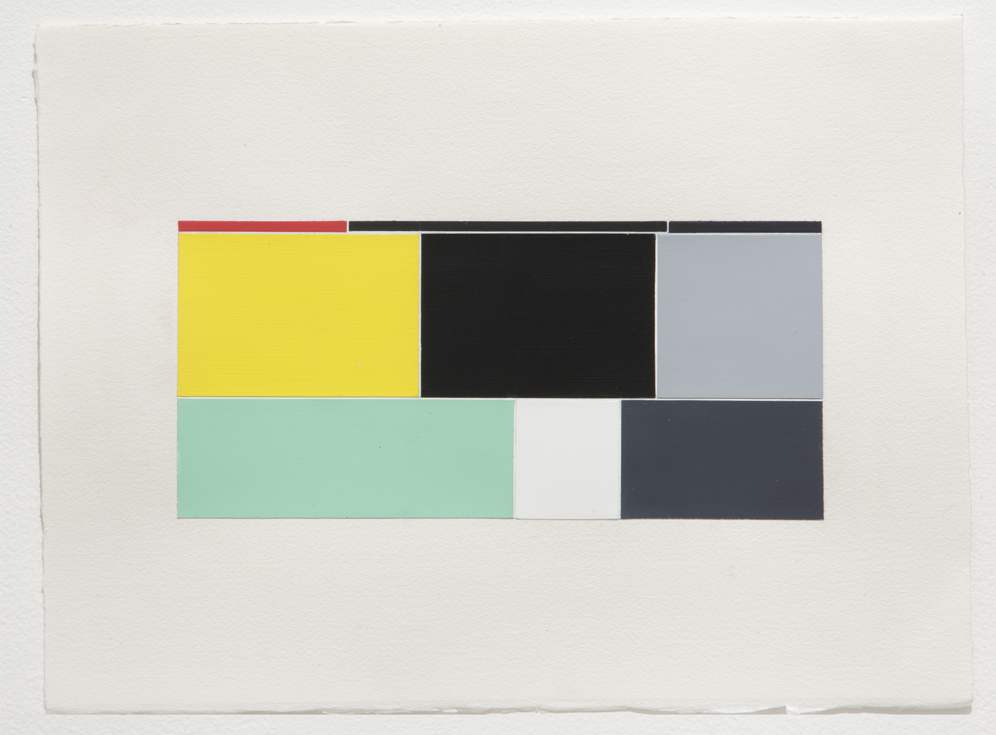
Loathing, Screenshot, .png image, 2100 X 720 px., 2015
Robert Bound: Tell us about Michael Genovese’s pieces. This one I feel in doing some preparatory note taking, I did need to be talked through it. Maybe you can fill me in.
Francesca Gavin: Genovese is great, I’ve been a fan of him for a long time. He is originally from Chicago and now he lives and works in Los Angeles. This show is an interpretation of the play on the history of abstraction and also touches in with the idea of how we use our phones. What he did is he looked up different words on his on phone, let’s take the word “guilt” and before things turn over and you’re using google image search you’re presented with these colored, cubic shapes and he’s translated that into these very finely made paintings. So, its very much about a translation of technology from one medium to another, but also at the same time, how do you reinvent our relationship to the abstract in a way that’s contemporary and interesting and has meaning, and I think he does it really well. The format of the paintings echoes the same kind of ratio of the actual format of a phone screen, so very much like, narrow and tall. Michael Genovese’s work at the moment is touching in on this heritage of Josef Albers or Ad Reinhardt, and this history from the 1960’s that’s being given new meaning in a contemporary context.
Robert Bound: What you’re looking at is neither one thing or another, its seems like a very contemporary/ futuristic take on the great subject of so many classical paintings; a sunrise or sunset, it neither here nor there, do you know what I mean? Do you get a sense of nature with this or does these seem exceptionally digital and machine made, not the images themselves, but what Michael Genovese is referencing?
Francesca Gavin: What I really like about this work is that there is a real physicality to it. It feels like it’s an object, it doesn’t feel digital, it doesn’t feel like something clinical in that sense or digitized. You really feel like someone has painted it, which I think is quite important and interesting. Personally, I am really fascinated about our relationship to screens, which I think is very different from our relationship to say television or movies, that kind of cinematic heritage. I think now we have a much more intimate relationship to the screen object/the phone, we touch it in our pocket, it becomes a more extension of ourselves in a way. So I think this is a really important and interesting thing that a lot of artists are addressing in this point and time. This is a very classic way of interpreting that. Other people have used this similar approach such as Rafael Rozendaal, but I think Mike’s new work has a real sense of depth to how it’s materialized.
Francesca Gavin is an Art Curator and Writer.
Robert Bound is a Cultural Editor at The Monocle, London.
Transcribed From: http://monocle.com/radio/shows/the-monocle-arts-review/251/
Video 1
Image Repository

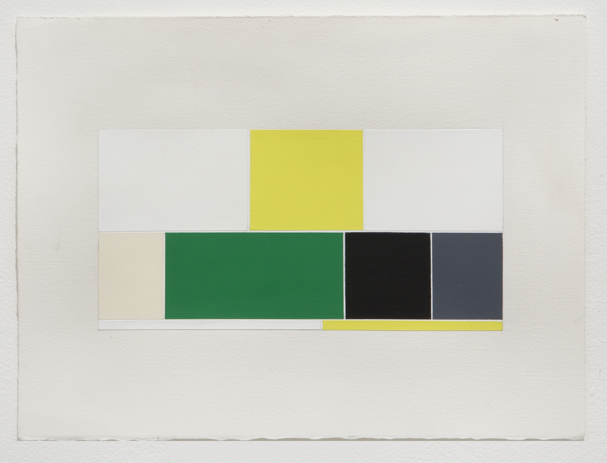
Intervals description table, Google image search: Winter (Seasons), Jpeg image, 5100 × 8025 px., 2015

Intervals description table, Google image search: Happy (Emotions), Jpeg image, 5100 × 8025 px., 2015
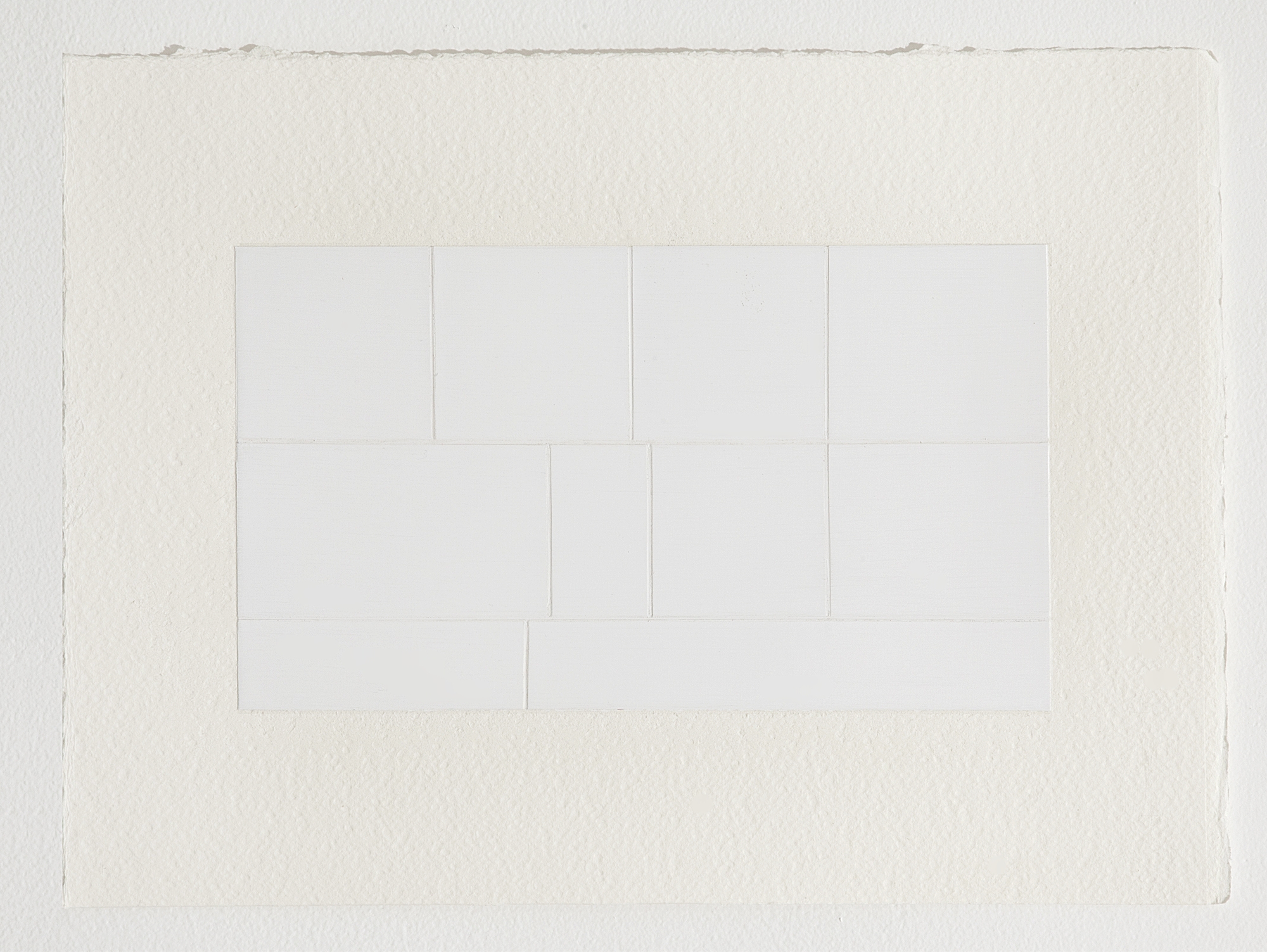
Work on Paper


More Light
Group Exhibition at Joan Los Angeles

Installation view

Google image search: Hope, Gesso and Acrylic paint on cotton paper, 15 x 22 inches
Part I
It is one of the commonest of mistakes to consider that the limit of our power of perception is also the limit of all there is to perceive. –C.W. Leadbeater
Sometimes he saw his real face / And sometimes a stranger at his place / Even the greatest stars find their face in the looking glass. –”The Hall of Mirrors,” Kraftwerk
The darkest place is underneath the lamp. -Chinese proverb
PART II
In his catalogue essay for the exhibition The Spiritual in Art: Abstract Painting, 1980–1985, (1986) at the Los Angeles County Museum of Art, curator Maurice Tuchman proposed that early historical abstraction was generated from five elements of the spiritual, which referred to underlying modes of thought – cosmic imagery, vibration, synesthesia, duality, and sacred geometry. More Light proposes new modes of thought such as the transference of language, science, perception, theosophy, and the transcendental. The exhibition presents painting, sculpture, film, and installation engaged with the interstitial spaces of the image-world and the intangible world.
PART III
More Light is an exhibition about perception, about the transmission of language, about storytelling and pithy statements. It is about allegory. It is about awareness of the outside world, and the individual, and a sensitivity to their plights and turmoil. It is about social identity and political power, and how those economies are communicated. It is about multi-vocality. The artists in the exhibition resist traditional images of the spiritual or the secular in favor of the prismatic and the plural. More Light asks to vanquish the dark in favor of the light for the sake of ourselves and of all others.
More Light is the third in a series of exhibitions organized by Gladys-Katherina Hernando, including—The White Album (2014), Richard Telles Fine Art, Los Angeles, and The Elegant Universe (2015), The Pit, Los Angeles—that explore the experiential relationship of art and the perception of the viewer.
NEW ART DEALERS ALLIANCE, NYC
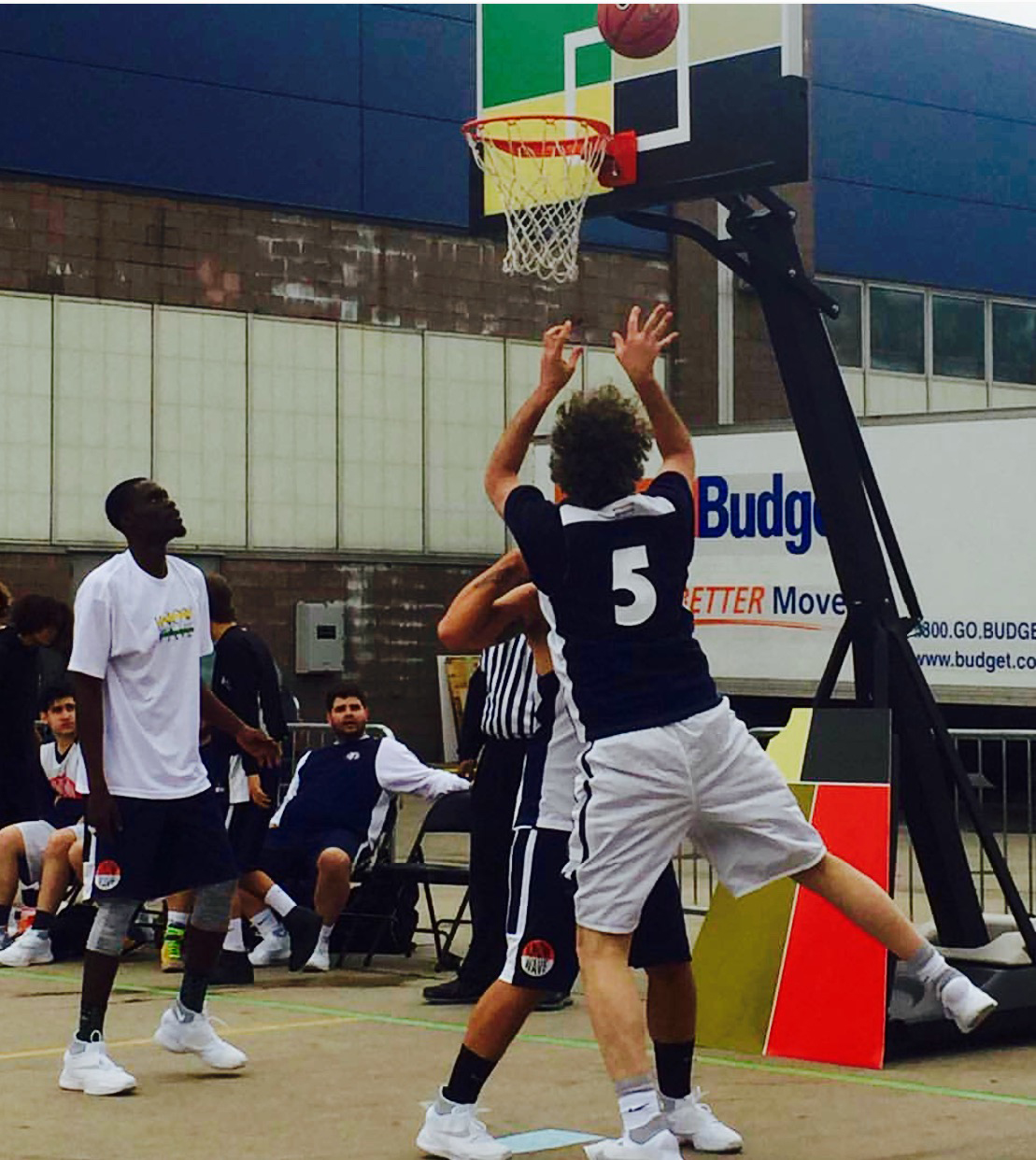
Know Wave Basketball Court Design | Pier 37, NYC


The General
Interior wall frescos | 102 N. 6th Street, Brooklyn
H & H (The General) Stage 5 wall frescos, Brooklyn, NY, 131 x 72 inches
Related Projects

Lines and Cracks

P.S. at Frost Art Museum

Post-Script Project Archive
© 2014-2023 Michael Genovese